 Connexion
Power Apps PDF Function: Create, View & Download PDFs
The new Power Apps PDF Function can generate a PDF document from any screen or control. It makes the task of creating PDFs very simple and only requires a standard license. Once the PDF is generated we can then view a PDF and download a PDF from directly inside of the app itself. In this article I will show you how to use the Power Apps PDF Function.
Table of Contents
• Introduction: The Work Orders App
• Setup The SharePoint List
• Insert A Vertical Container
• Add A Power Apps Form To The Vertical Container
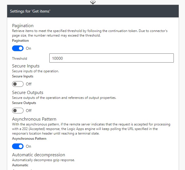
• Enable The Power Apps PDF Function Experimental Feature
• Generate A PDF Of The Power Apps Form
• View The PDF In Power Apps
• Create A SharePoint Document Library To Store PDF Files
• Build A Flow To Download PDF Files From A SharePoint Document Library
• Download The PDF Directly From Power Apps
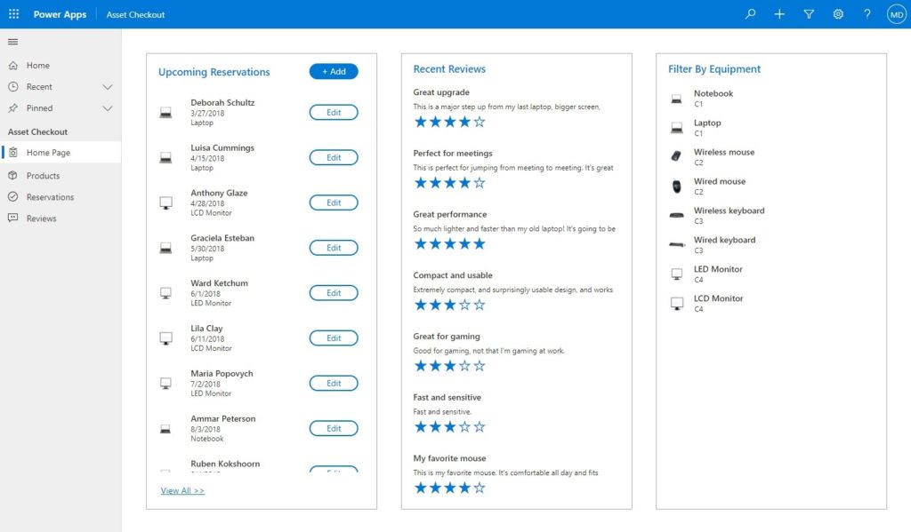
Introduction: The Work Orders App
The work orders app is used by employees at a plumbing services company to track job details. An employee can view a PDF of the Work Order form on their device and download a copy of the PDF.
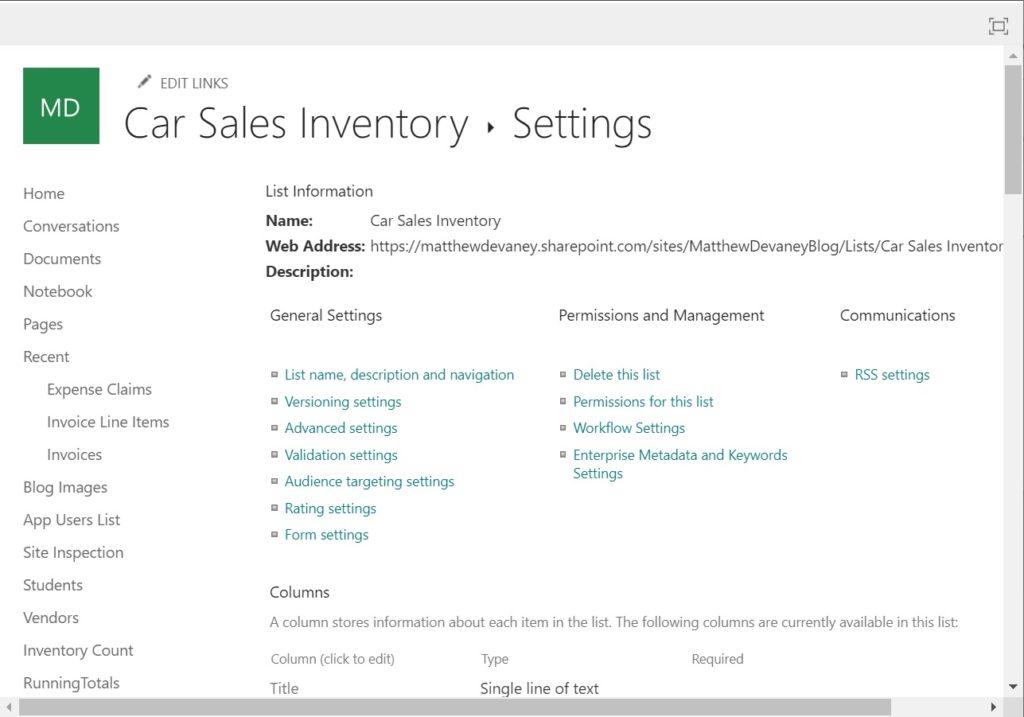
Setup The SharePoint List
Create a new SharePoint list named Work Orders with the following columns:
- Map (image)
- Address (single line text)
- LastName (single line text)
- AppointmentStart (date only)
- IssueReported (single line text)
- MaterialsRequired (single line text)
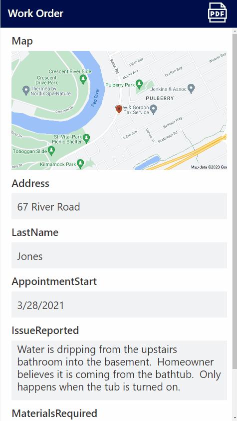
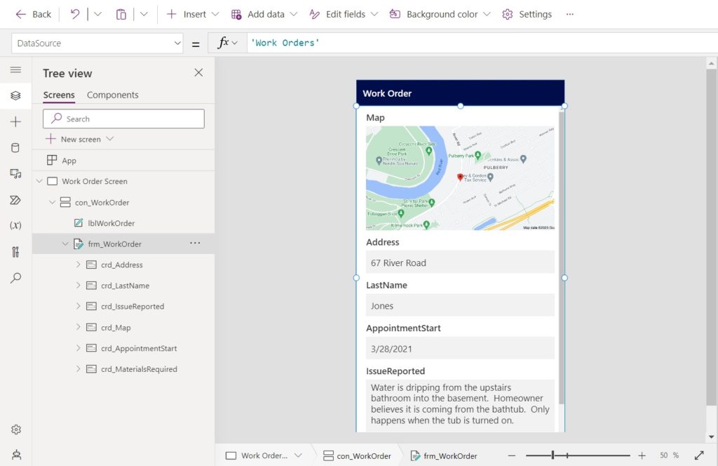
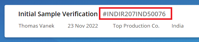
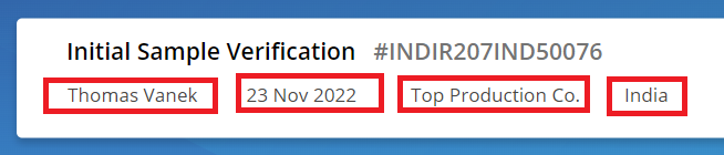
Add a new row to the SharePoint list with this data. We will display it on the Work Order PDF.
| Column | Value |
| Map | 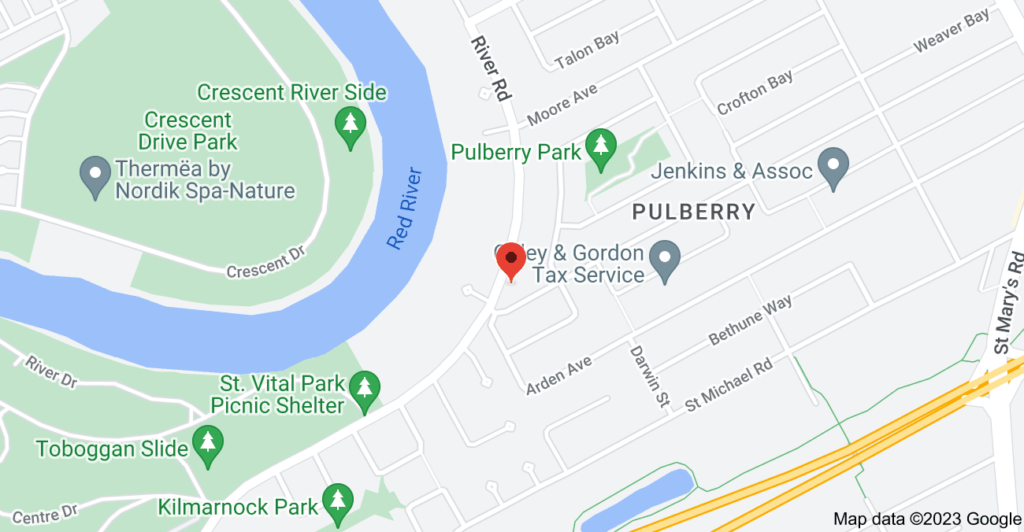 |
| Address | 67 River Road |
| LastName | Jones |
| AppointmentDate | 3/28/2021 |
| IssueReported | Water is dripping from the upstairs bathroom into the basement. Homeowner believes it is coming from the bathtub. Only happens when the tub is turned on. |
| MaterialsRequired | 5 – PVC Pipes 1 – Tube Of Sealent 10 – Screws |
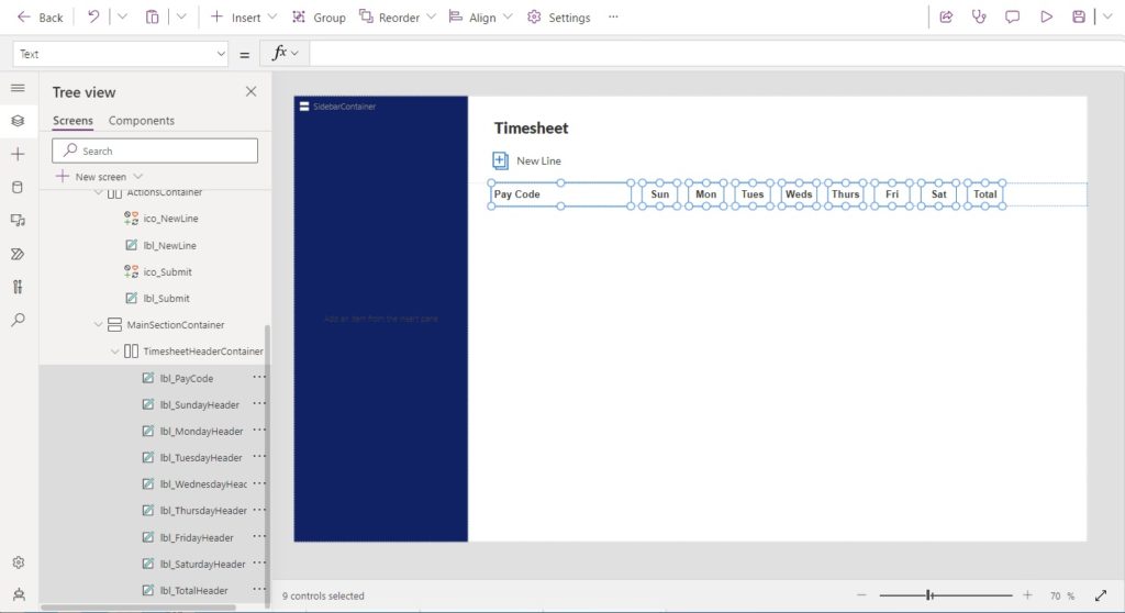
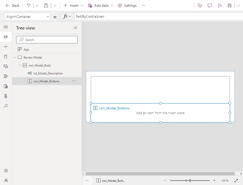
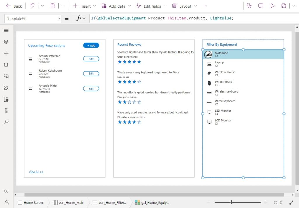
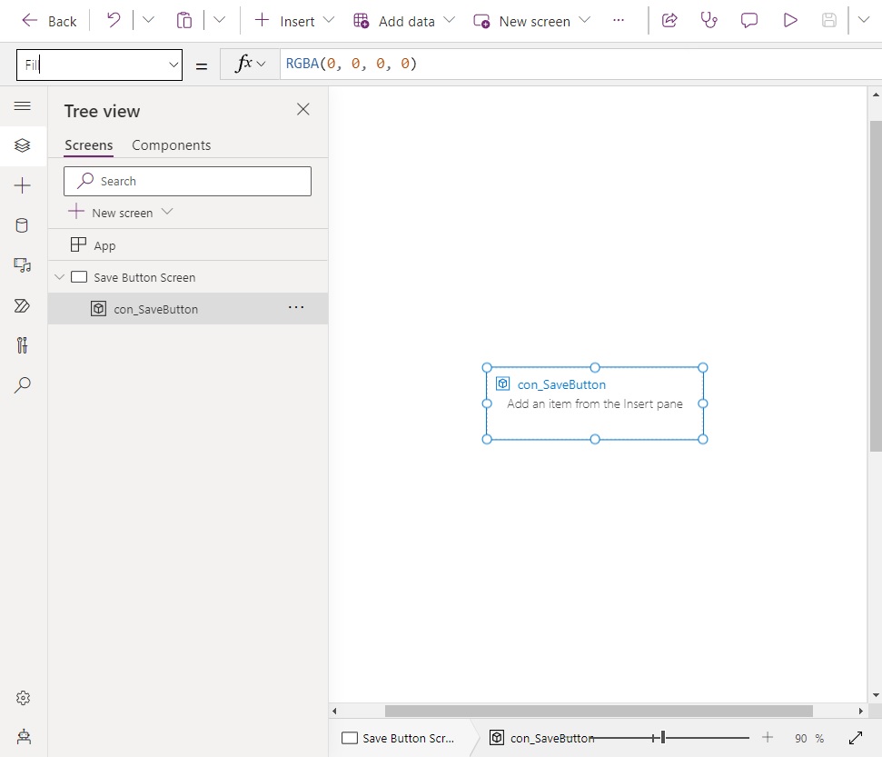
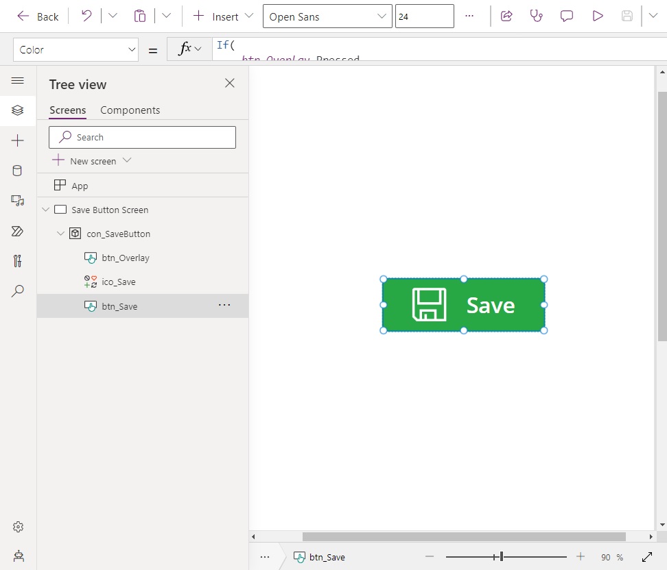
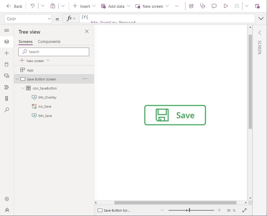
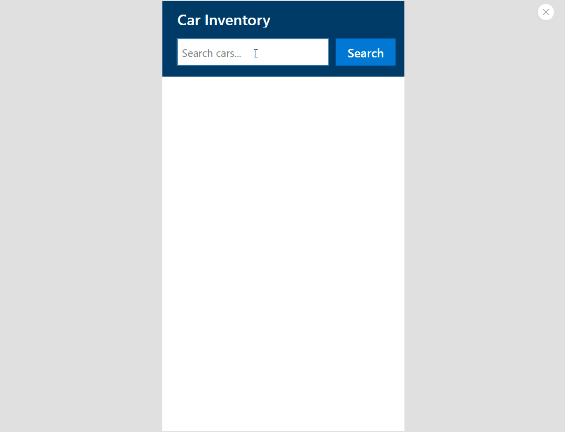
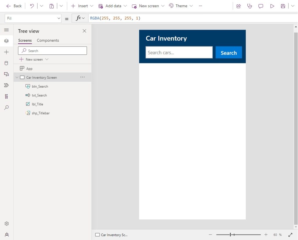
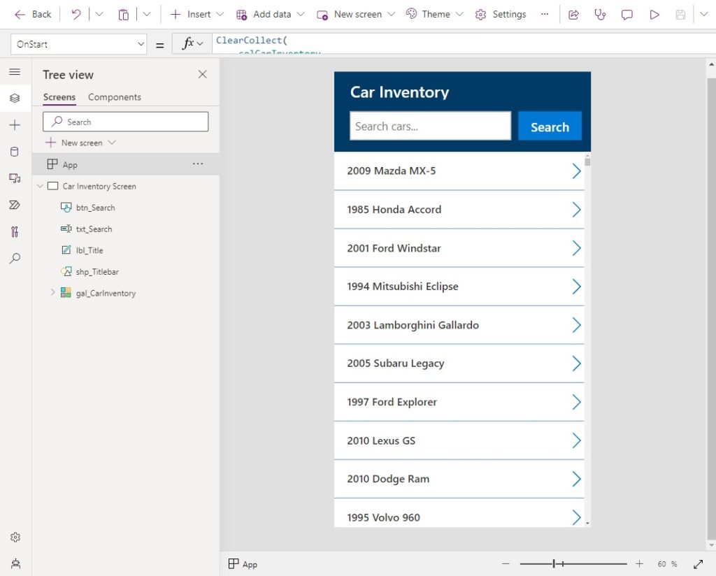
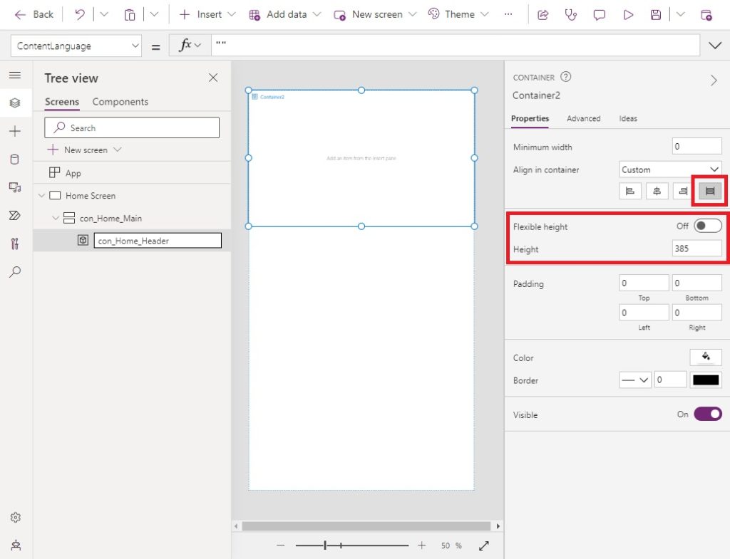
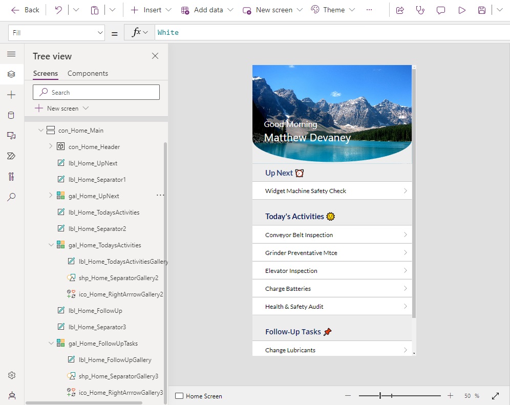
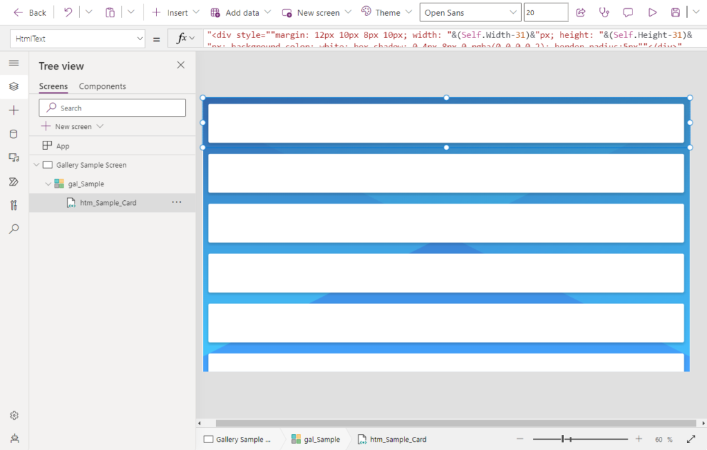
Insert A Vertical Container
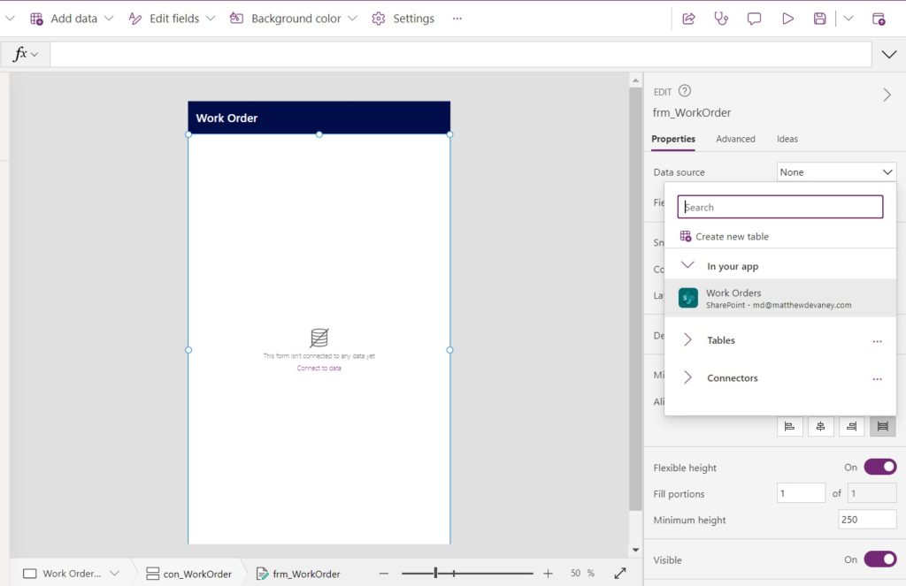
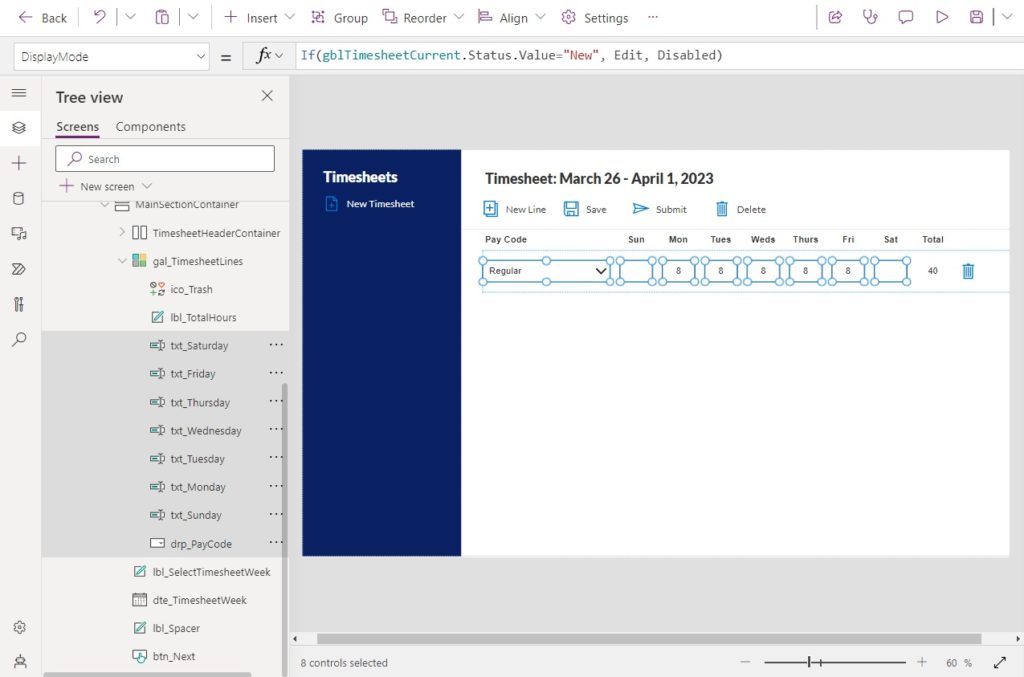
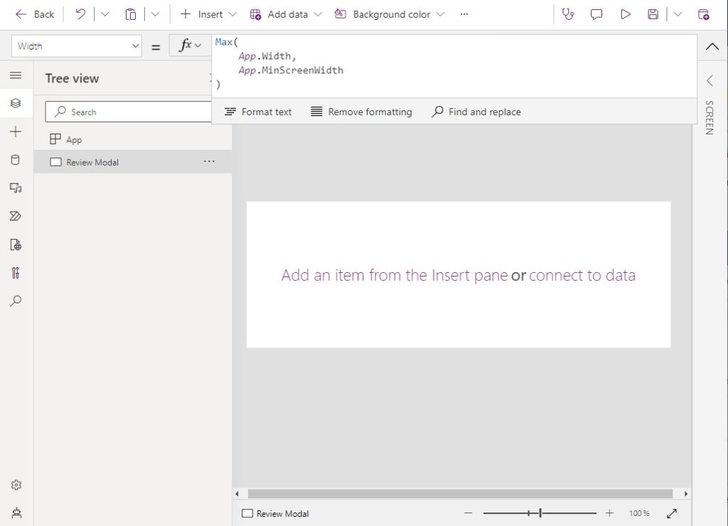
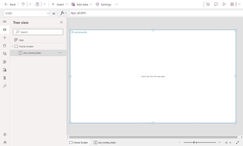
A PDF cannot be generated for a Power Apps Edit Form so we must use a workaround. We can place an Edit Form inside of a container and create a PDF of container’s contents instead. Open Power Apps Studio and create a new app from blank. Insert a vertical container onto the screen.
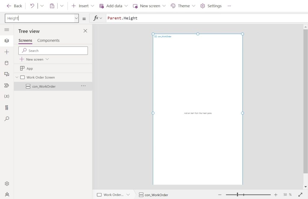
Make the vertical container fill the screen by giving the following properties these values.
Height: App.Height
Width: App.Width
X: 0
Y: 0
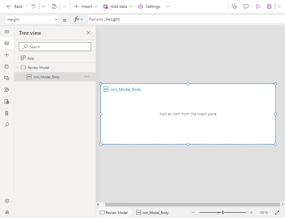
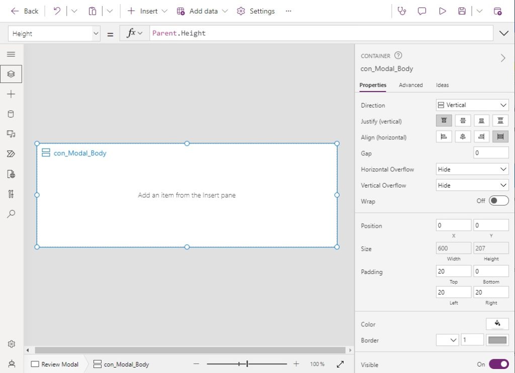
Set the LayoutAlignItems property to this value to make them fill the width of the container.
LayoutAlignItems.Stretch
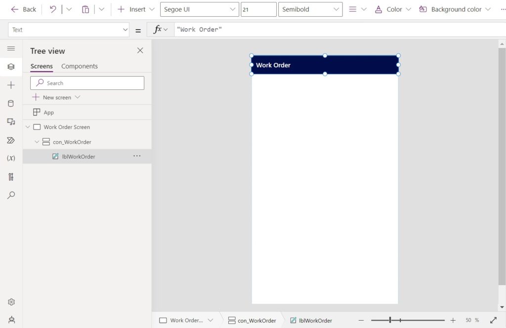
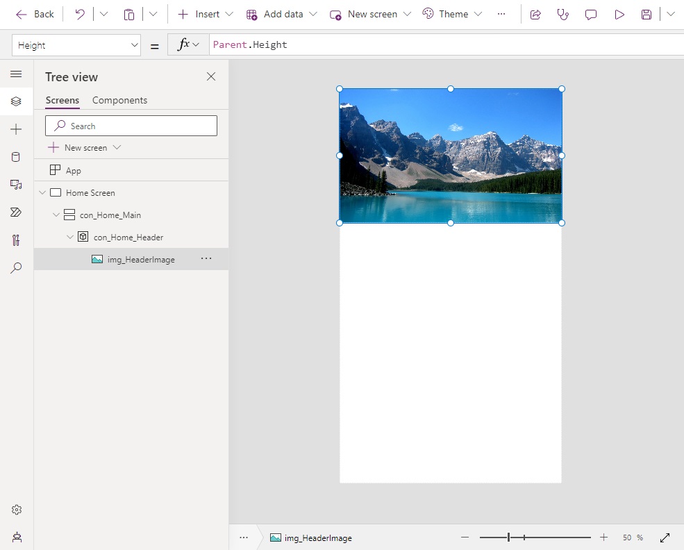
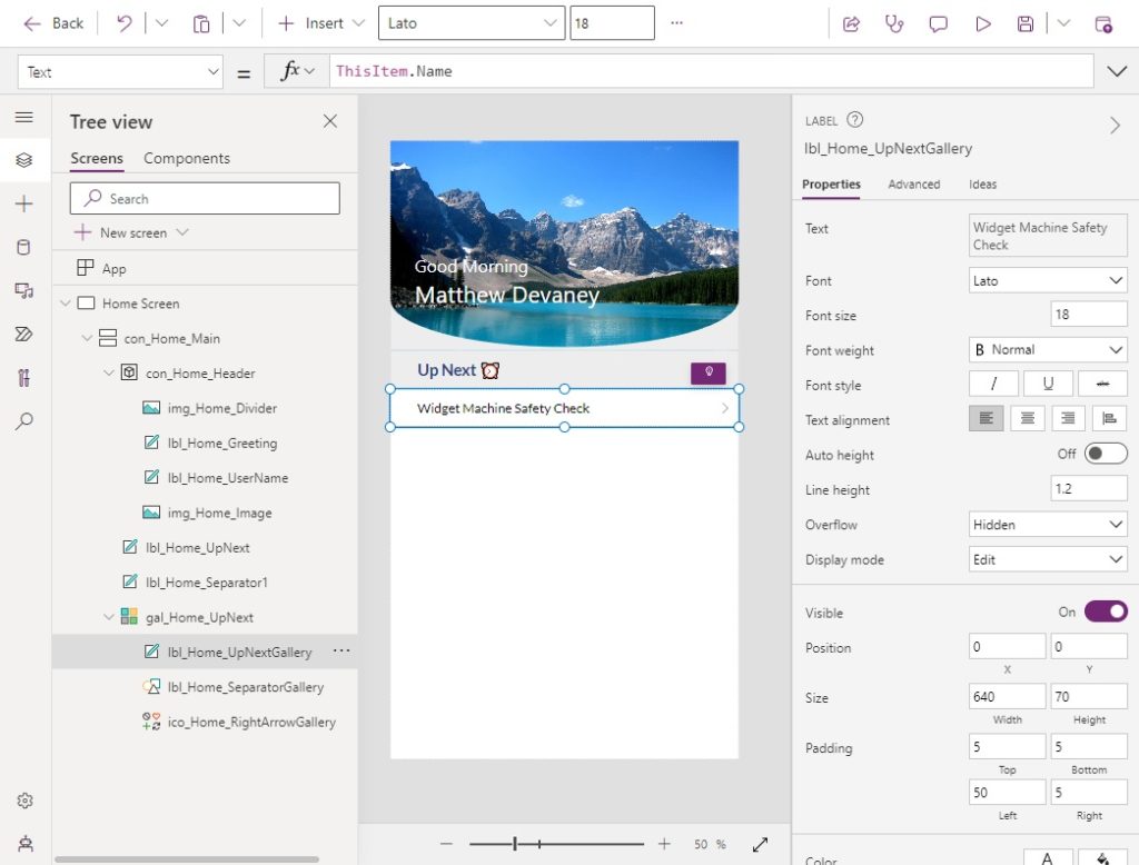
Add a label to the container to use as a title bar. Give it the text “Work Order” and apply a dark blue fill.
Add A Power Apps Form To The Vertical Container
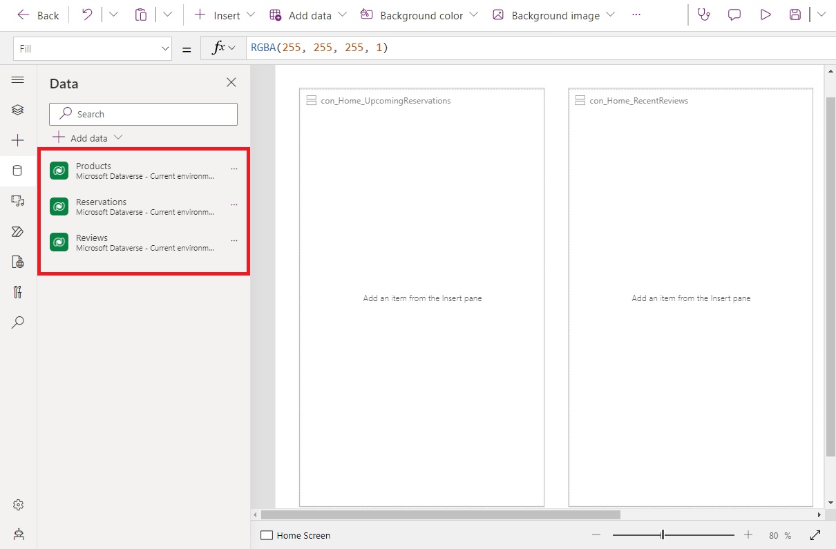
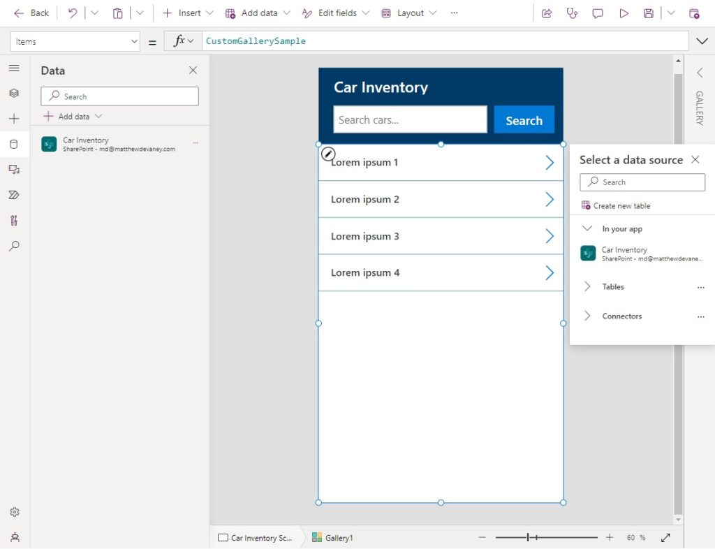
Next we will create a Power Apps Edit Form to display Work Order information. Open the Data tab from the left navigation menu and add the Work Orders SharePoint list as a data source.
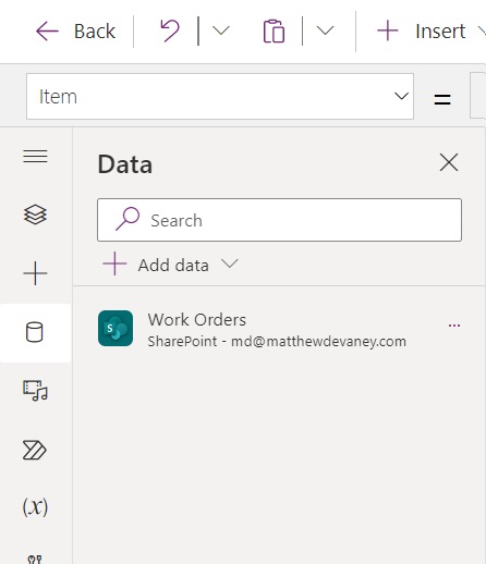
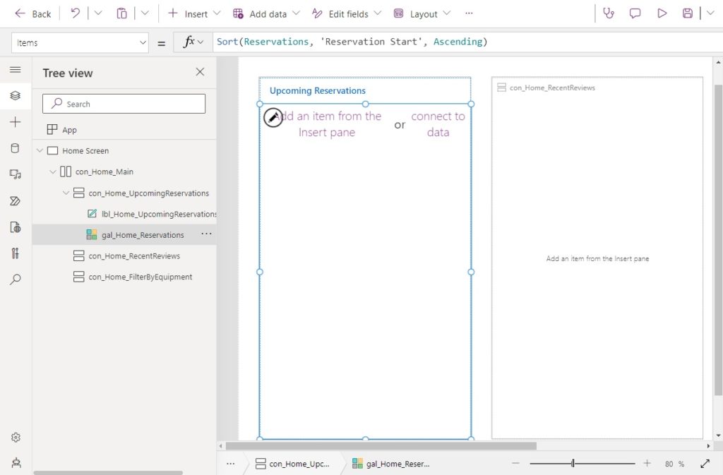
Insert a Power Apps Edit form into the vertical container. Select the Work Orders SharePoint list as the data source.
Update the Edit Form to use a vertical layout with only 1 column.
Use this code in the Item property of the form to display the first record in the SharePoint list. In this tutorial the user will not have an ability to select another record.
LookUp('Work Orders', ID=1)
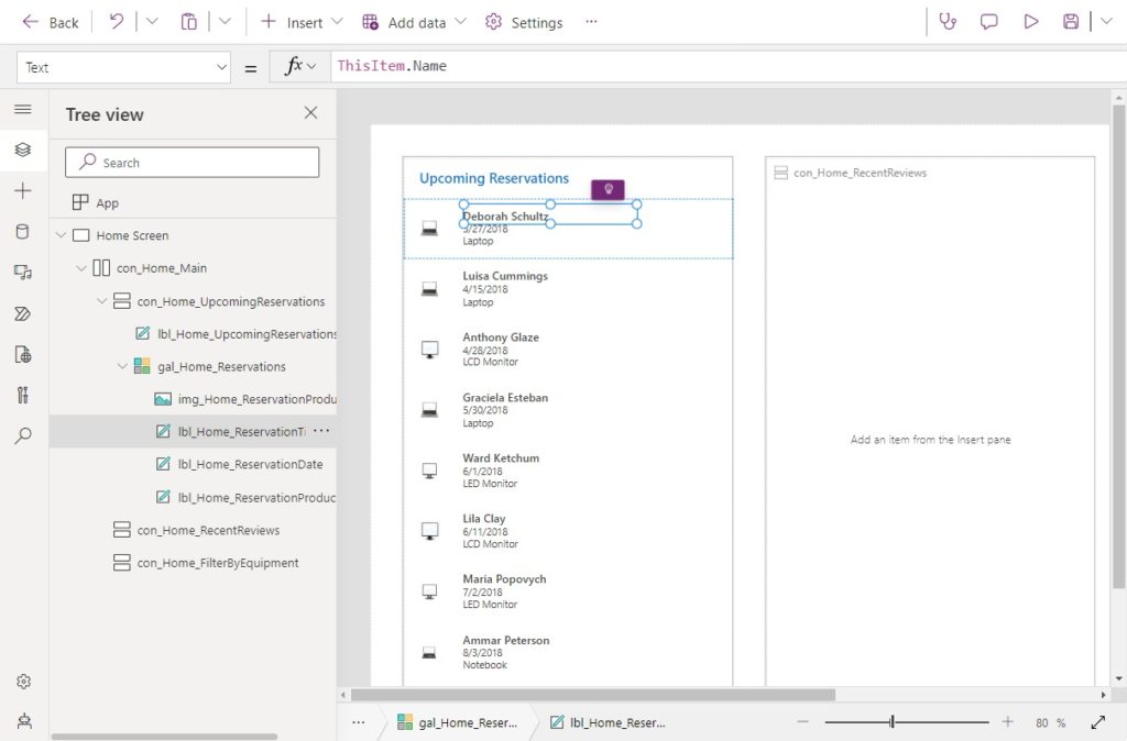
Change the DisplayMode property of the the Edit Form to View.
DisplayMode.View
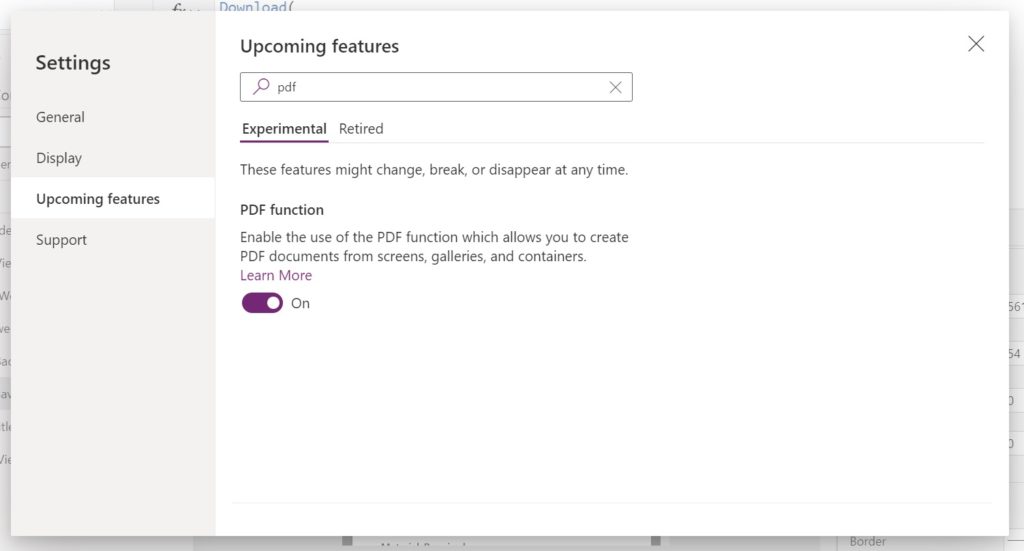
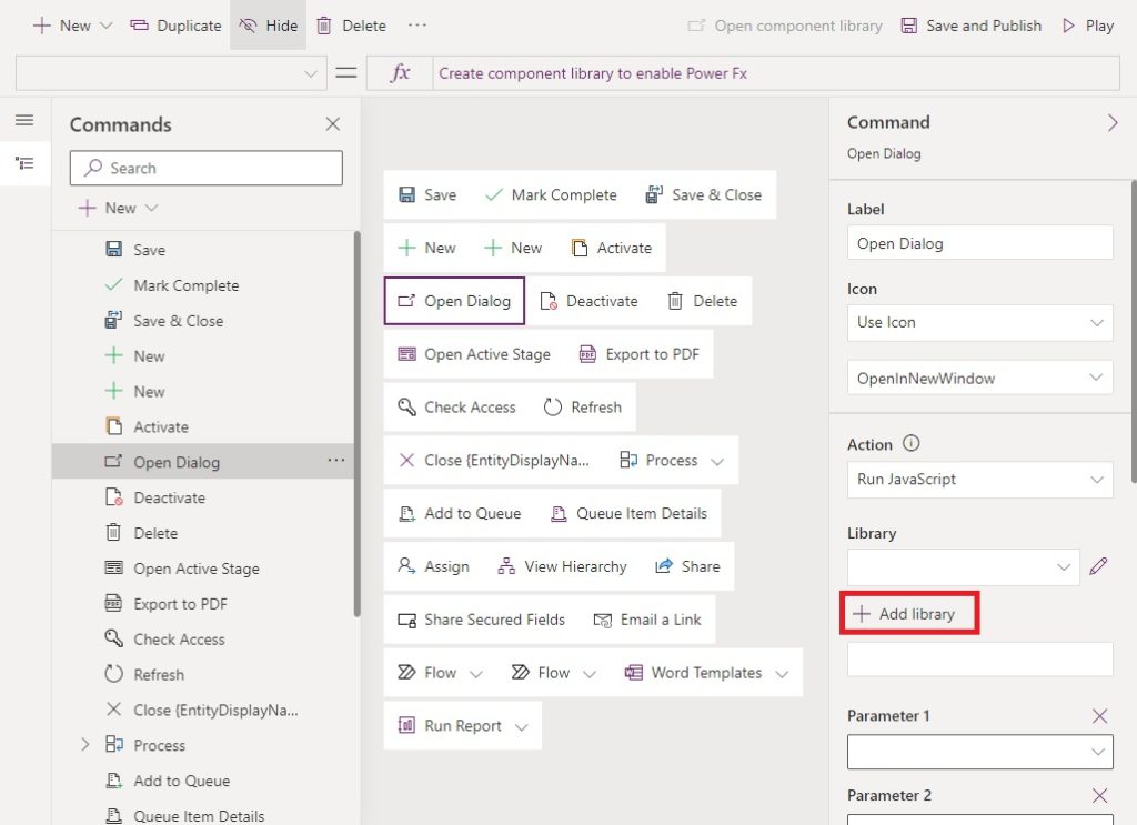
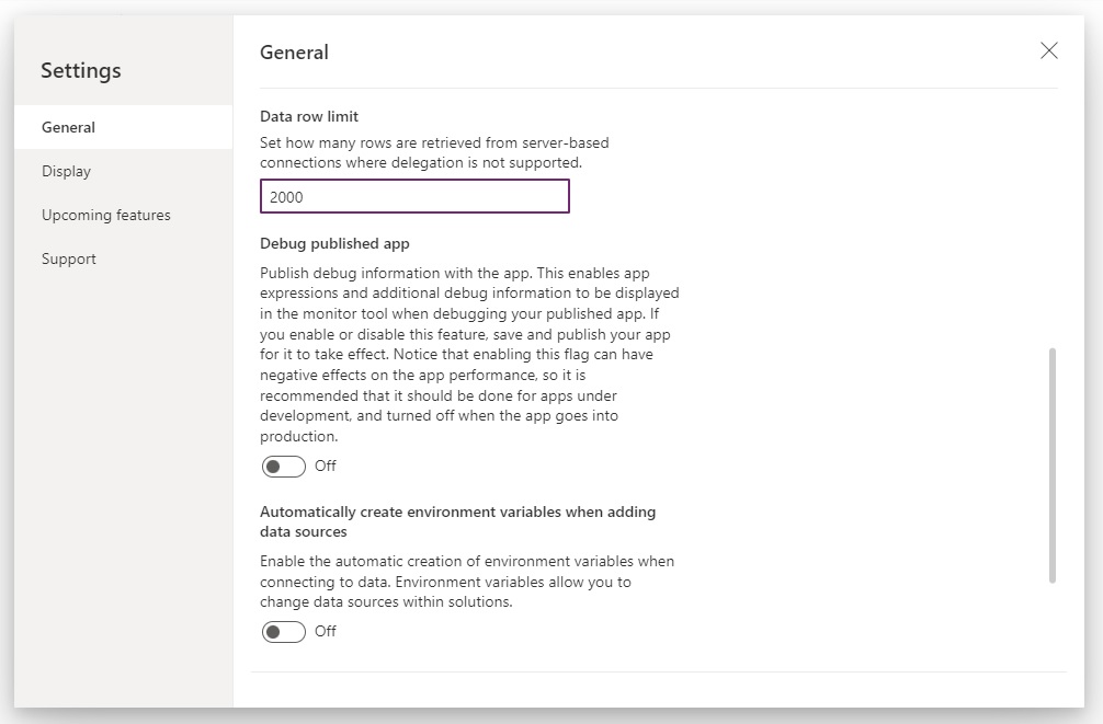
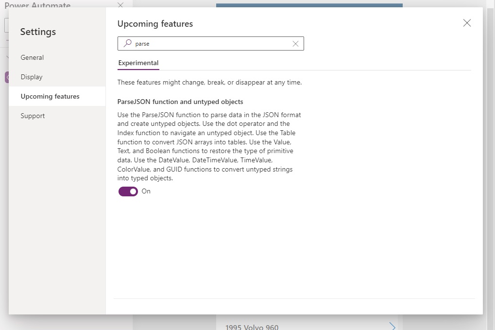
Enable The Power Apps PDF Function Experimental Feature
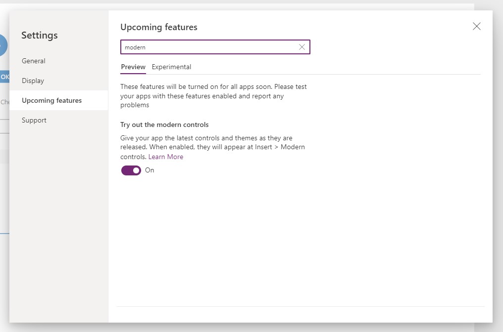
The Power Apps PDF Function is an experimental feature and is not enabled by default. To use it, go to the Settings menu, select upcoming features, then toggle on the PDF Function setting.
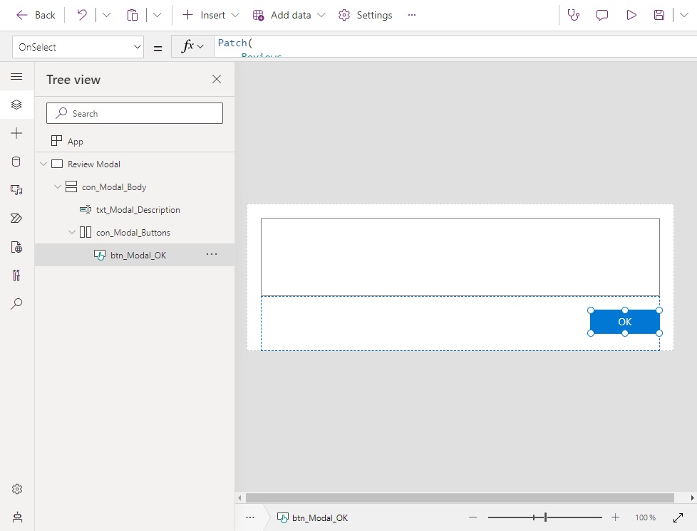
Generate A PDF Of The Power Apps Form
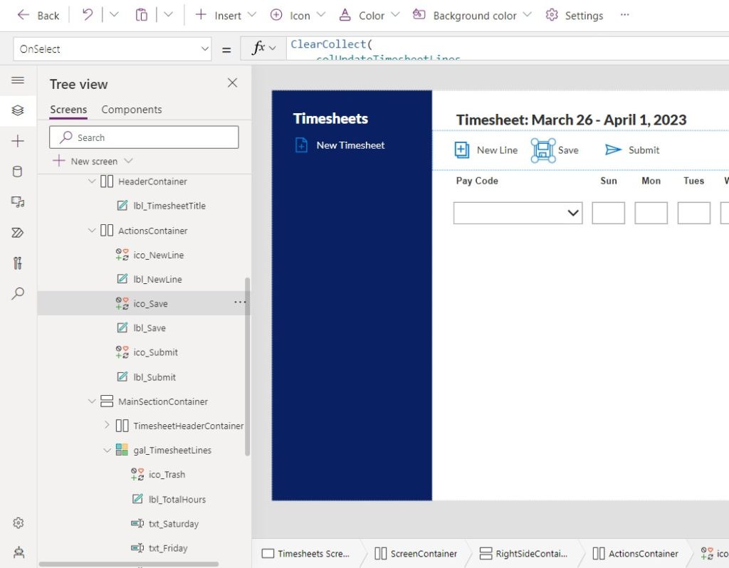
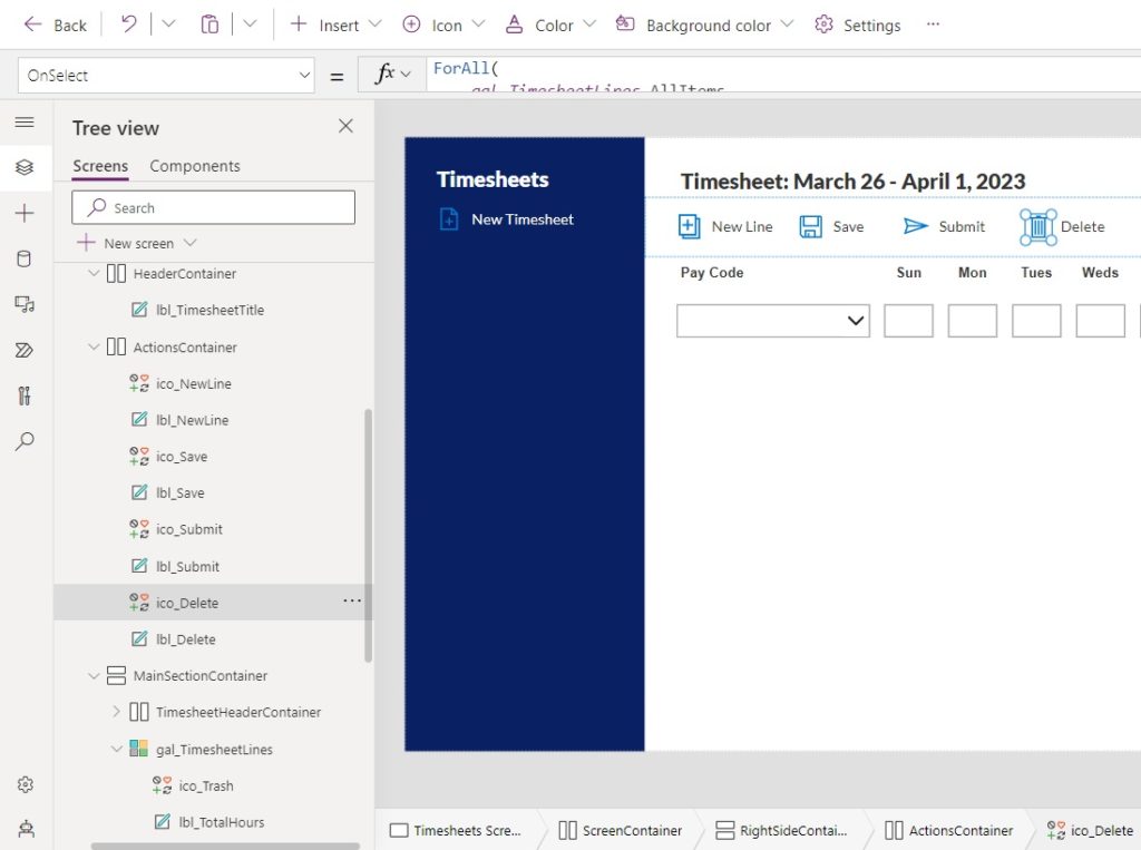
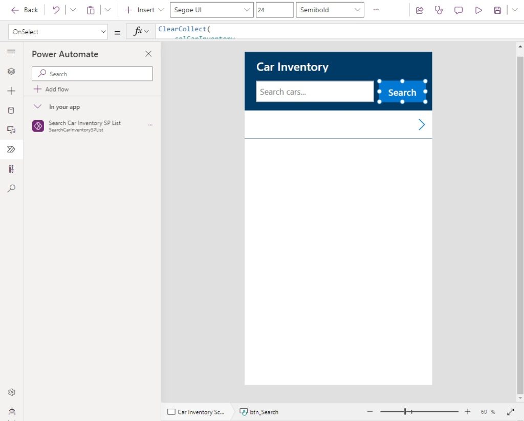
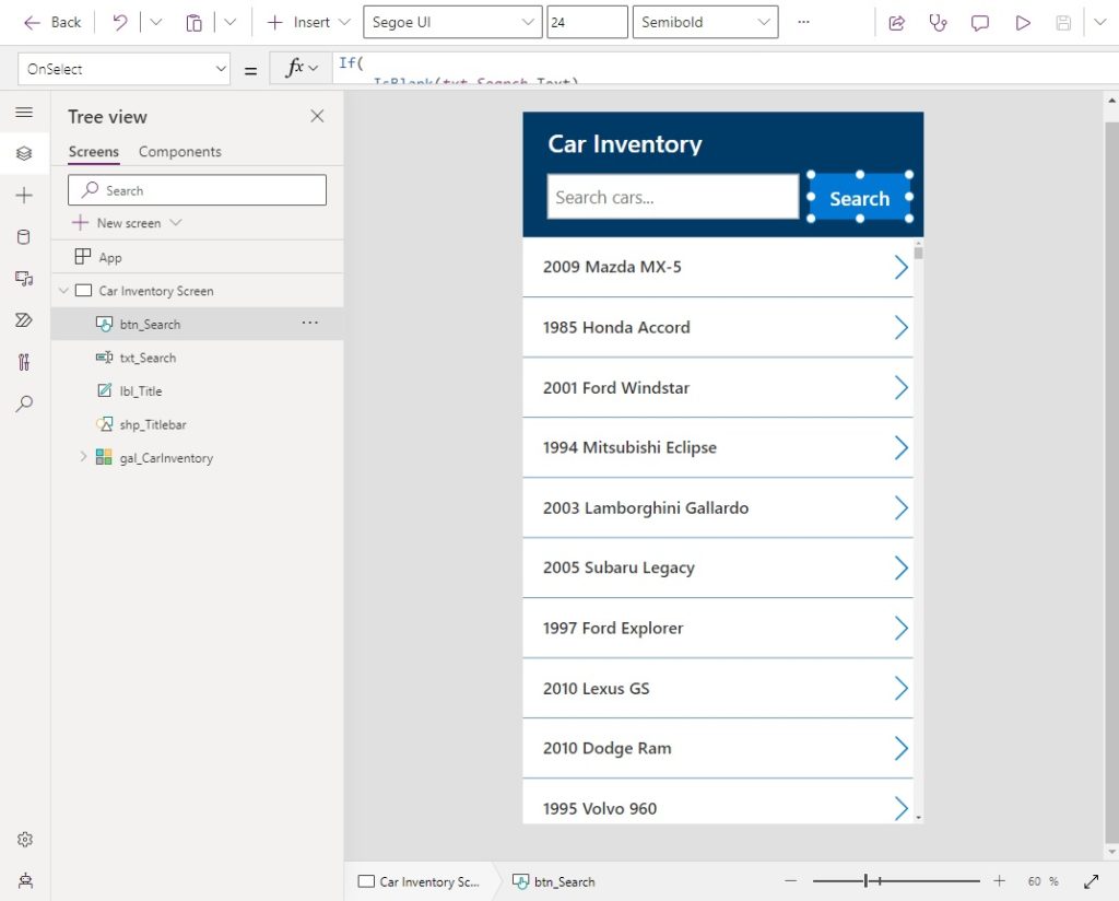
When the user clicks on a PDF icon it generates the PDF and navigates to a screen with PDF viewer. Add a PDF icon to the app’s titlebar.
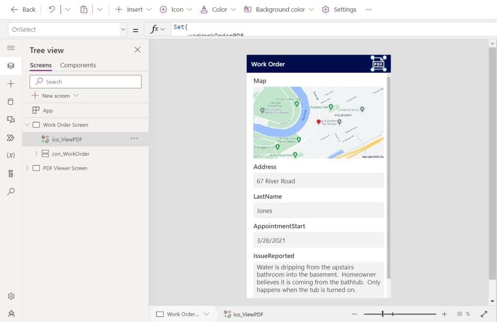
Then write this code in the icon’s OnSelect property.
The first argument to the Power Apps PDF Function tells it which screen or control to generate a PDF from. The second argument can be used to pass in optional values to control the PDF’s size, orientation, margins & DPI. Here we will use the ExpandContainers parameter to ensure the container expands to show any hidden or off-screen controls.
Set(
    varWorkOrderPDF,
    PDF(
        con_WorkOrder,
        {ExpandContainers: true}
    )
);
Navigate('PDF Viewer Screen');
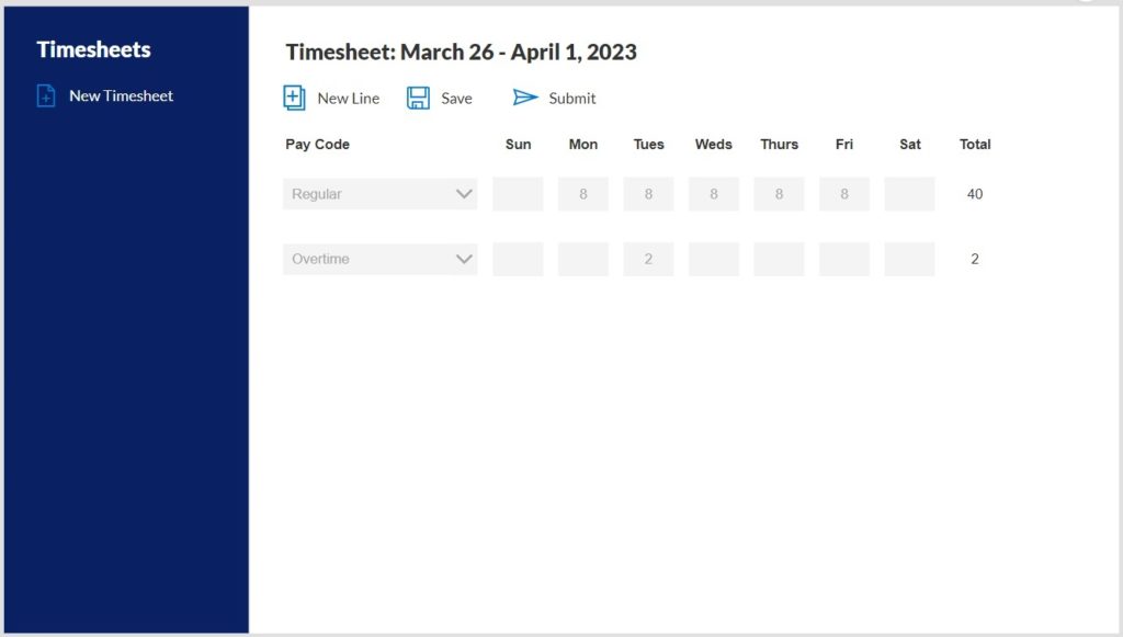
View The PDF In Power Apps
We need to make another screen to display the PDF. Create a new screen named PDF Viewer Screen. Add a dark blue label for a titlebar and insert a left arrow icon in the top-left corner.
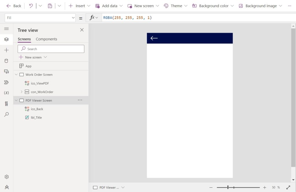
Use this code in the OnSelect property of the left arrow icon to navigate back to the previous screen.
Set(varWorkOrderPDF,Blank());
Navigate('Work Order Screen');
Add the PDF Viewer control the screen. Position the PDF Viewer control so it fills the remaining space on the screen.
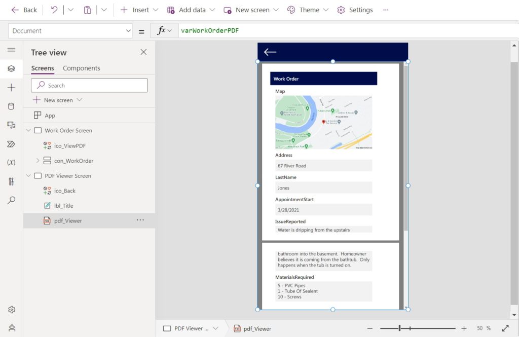
Use this code in the document property of the PDF. The PDF document will now display in the PDF viewer.
varWorkOrderPDF
Test the feature we built to generate and view a PDF from Power Apps. It should look like this.

Create A SharePoint Document Library To Store PDF Files
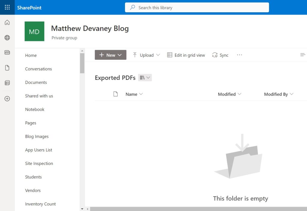
We want to create the ability to download the PDF file directly from Power Apps. To do this, we need a place to temporarily store the PDF file. Make a new SharePoint Document library named Exported PDFs. No additional setup is required beyond creating the document library.
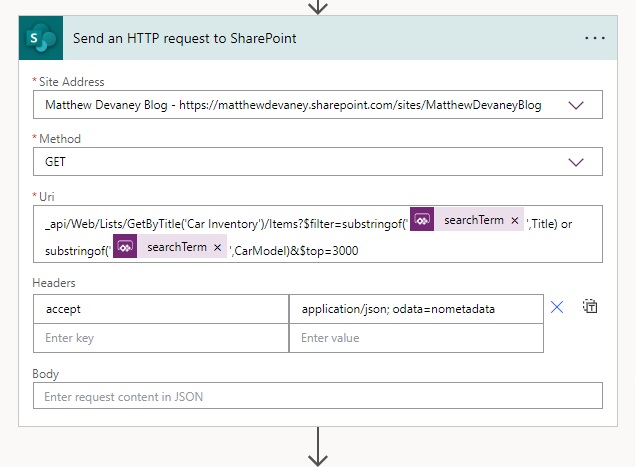
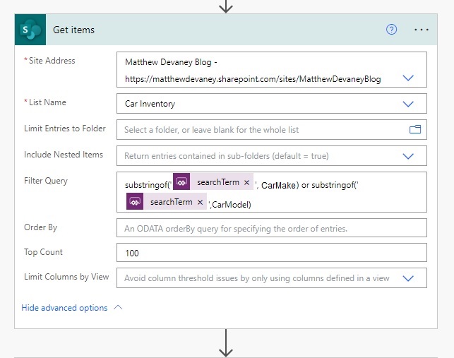
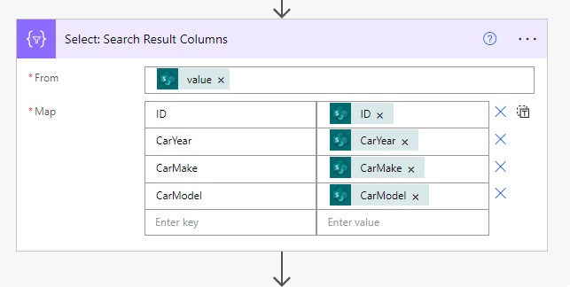
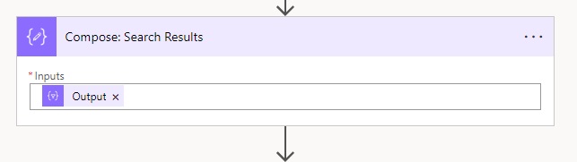
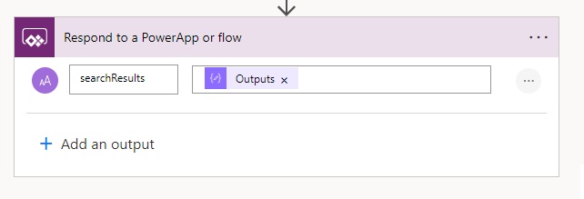
Build A Flow To Download PDF Files From A SharePoint Document Library
To download the PDF file we must make a flow to store the PDF file in SharePoint and then return a file download link to the app. Open Power Automate, create a new flow named Download PDF From Power Apps and setup the flow as show in the image below.
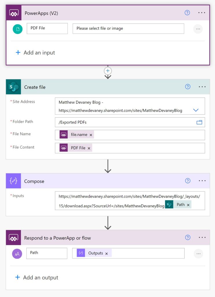
Use this code in the File Name property of the SharePoint – Create File action.
triggerBody()['file']['name']
A link to the PDF file in SharePoint opens it in the SharePoint document viewer. However, we want to perform a direct download of the PDF file instead. We can use this special URL to bypass the SharePoint document viewer and download the file. Fill in any tags <> with your own values.
https://<tenantname>.sharepoint.com/sites/<site collection title>/_layouts/15/download.aspx?SourceUrl=/sites/<site collection title>/<file path with the library name>
My completed URL looks like this.
https://matthewdevaney.sharepoint.com/sites/MatthewDevaneyBlog/_layouts/15/download.aspx?SourceUrl=/sites/MatthewDevaneyBlog/Exported PDFs/WorkOrder_20230423081046.pdf
Download The PDF Directly From Power Apps
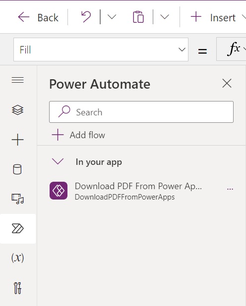
Now that the Power Automate flow is completed go back to Power Apps Studio and add the Download PDF From Power Apps flow to the app.
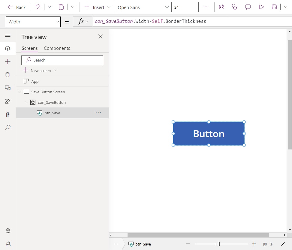
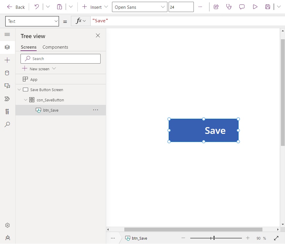
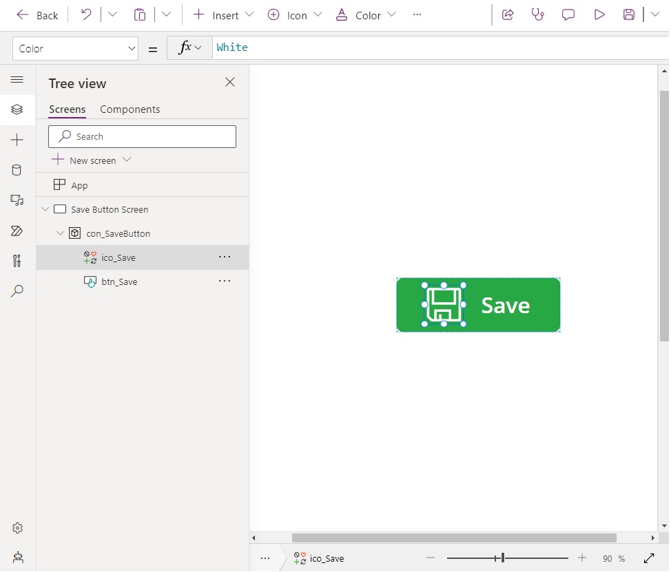
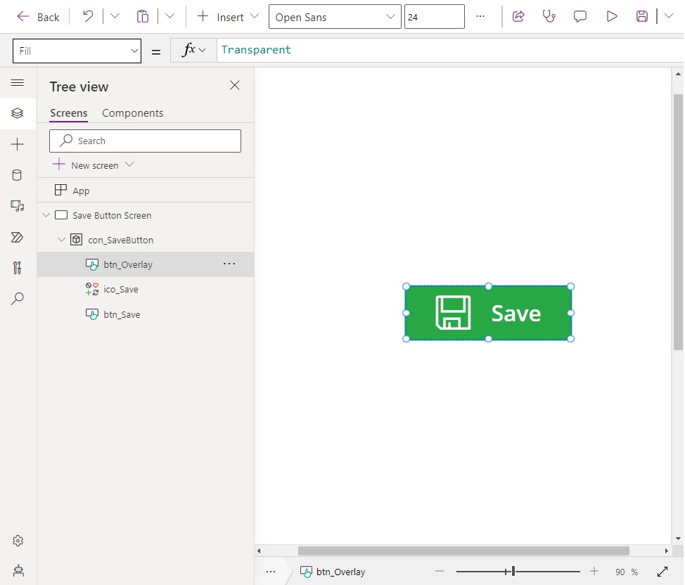
Insert a save button icon in the top left corner of the PDF Viewer Screen.
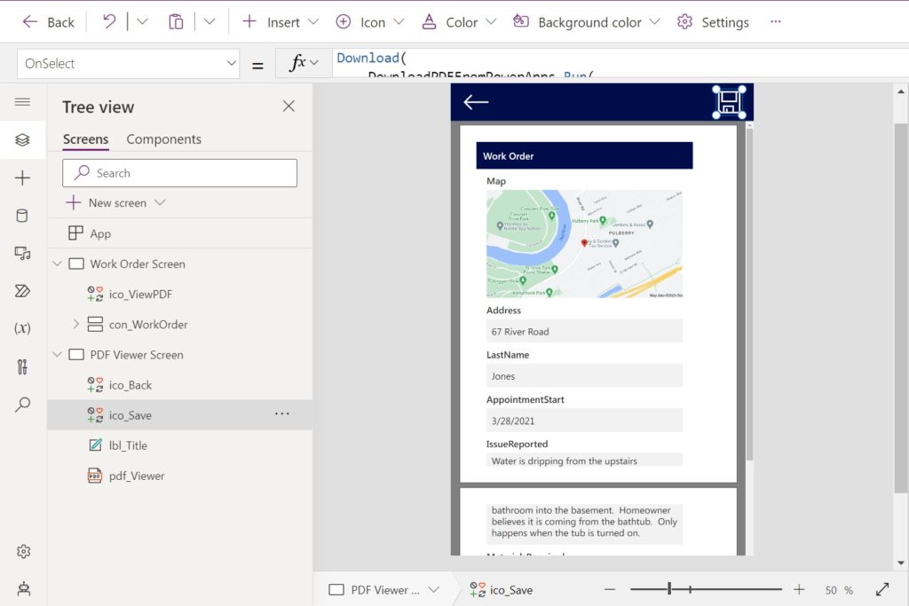
Then add this code to the OnSelect property of the save icon. The Download function downloads a file from the internet to the user’s device. We get the file’s web address returned in the path property of the Download PDF From Power Apps flow.
Download(
    DownloadPDFFromPowerApps.Run(
        {
            name: $"WorkOrder_{Text(
                Now(),
                "yyyymmddhhmmss"
            )}.pdf",
            contentBytes: varWorkOrderPDF
        }
    ).path
);
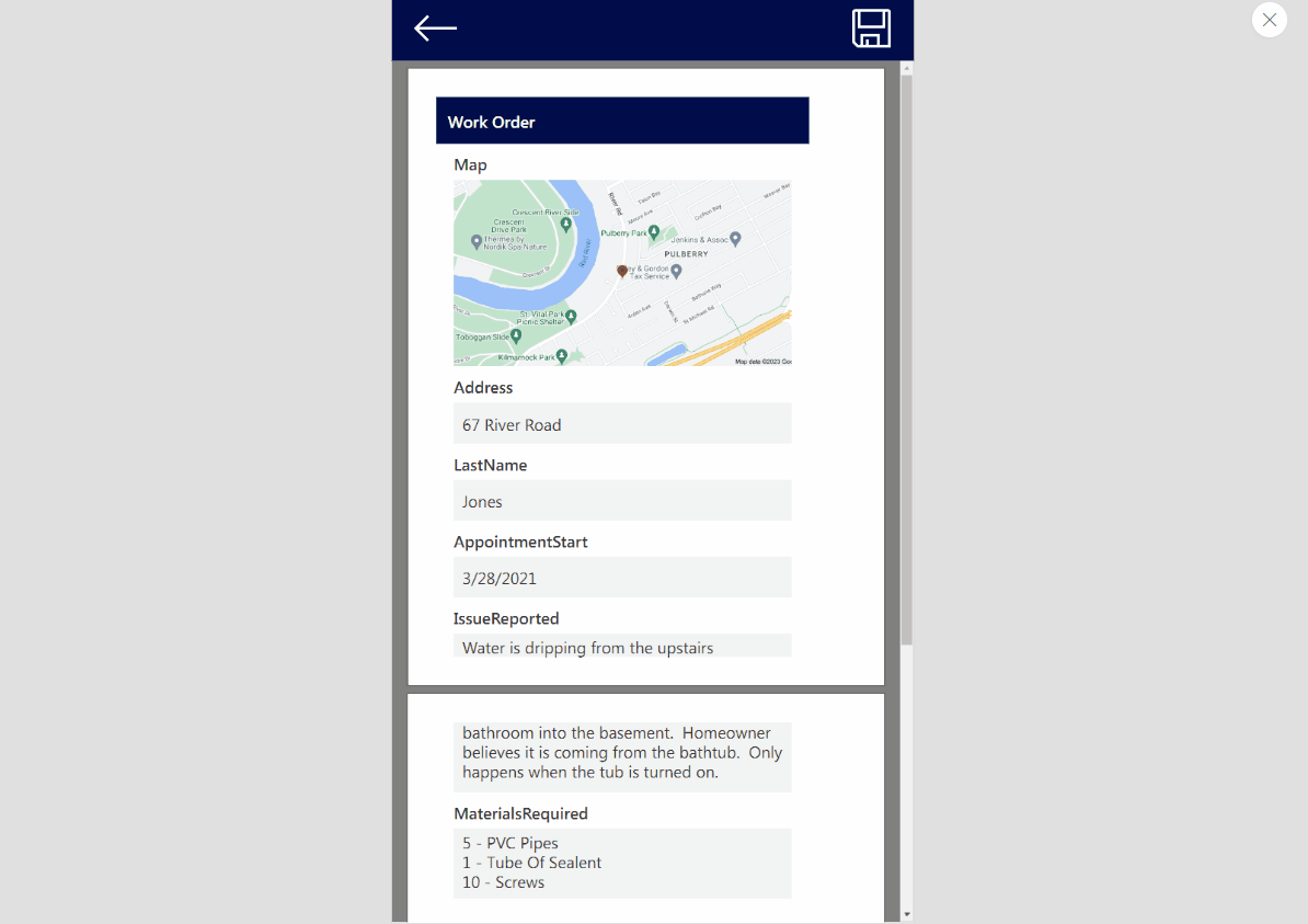
Test the completed download PDF from Power Apps feature. It should work like this:
Did You Enjoy This Article? 
Subscribe to get new Power Apps articles sent to your inbox each week for FREE
Questions?
If you have any questions or feedback about Power Apps PDF Function: Create, View & Download PDFs please leave a message in the comments section below. You can post using your email address and are not required to create an account to join the discussion.
The post Power Apps PDF Function: Create, View & Download PDFs appeared first on Matthew Devaney.


 "
"
 "
" "
"


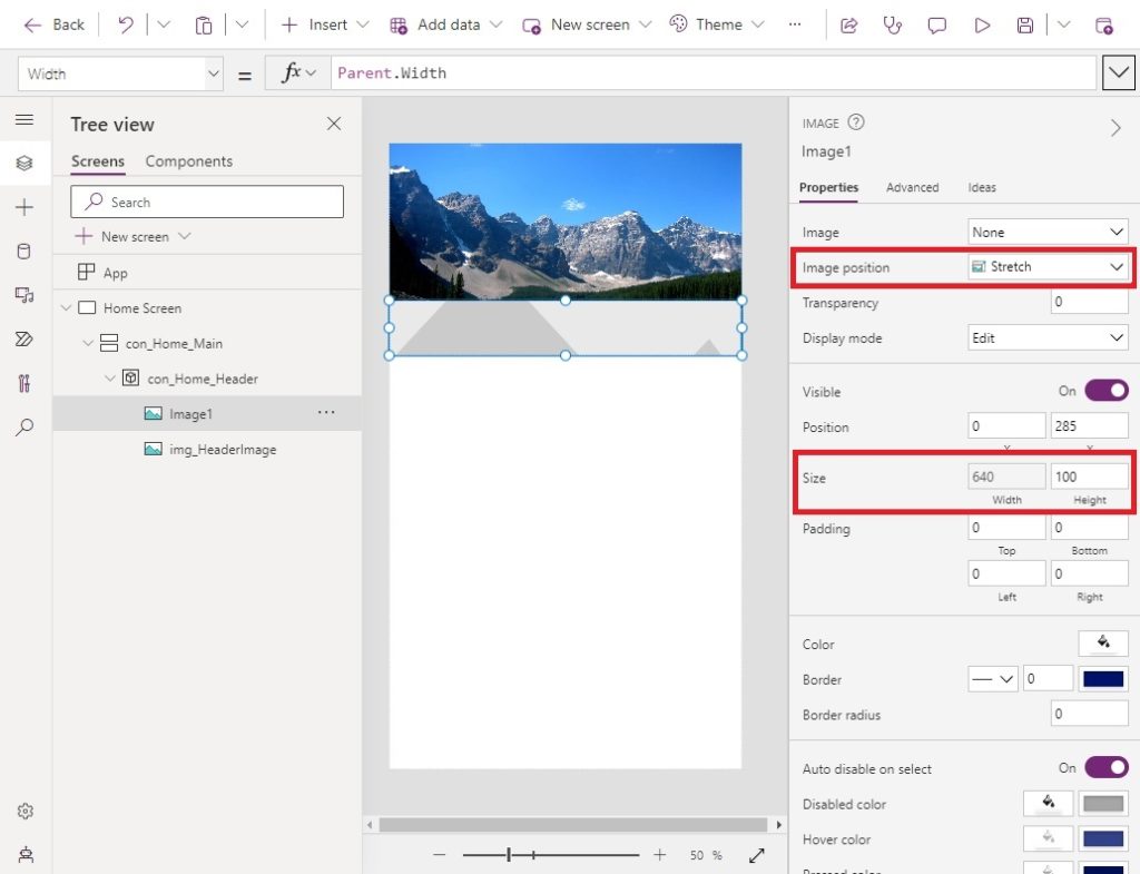
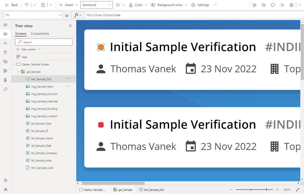
 It means showing the reader what to focus on using size, color, font weight, direction, etc. Of all the Power Apps design tips, this one is my favorite because it’s so simple yet powerful.

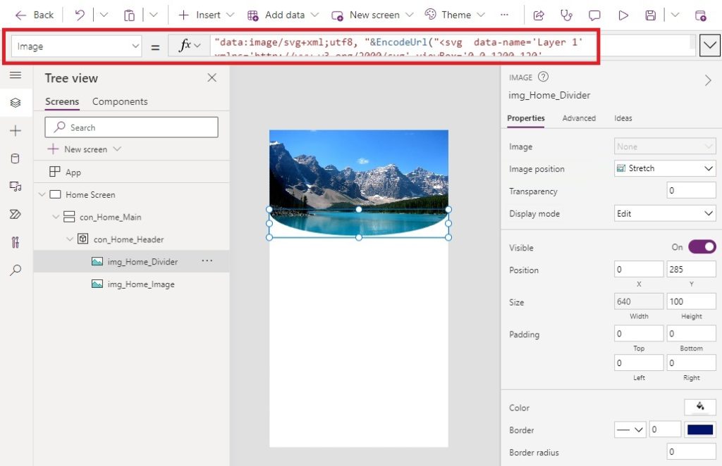
 . We can get better ones though by using custom SVG image code instead.


 .
.