It’s possible to create custom forms for SharePoint lists/libraries using Power Apps, directly from the list command bar by using the option Integrate/Power Apps/Customize the form:
This allows you to create a custom form using all features that a Canvas app offers. While you can keep all the out-of-the-box SharePoint list view native features, such as sorting, filtering, grouping & using JSON formatting, you will be able to build an entire new form by using the Canvas apps studio.
Variables and form behaviour
It’s great to be able to customize the form only and quickly build more advanced forms by using Power Fx and Canvas apps features, however it’s important to bear in mind how variables work.
The event Screen.OnVisible, will run only by on the first time you open an item in a list/view, OR if you create multiple screens and navigate to it. This means that when you select another item in the view, the event Screen.OnVisible is not going to be triggered automatically. For a person used to work with Canvas apps this can cause some confusion and maybe lead to a few bugs in the form if the behaviour is not understood when building the form.
Based on this, even though you can use context variables, they might not be that useful if you want to control data related to specific items or form instances open. For example if you have a form with multiple tabs and want to store the selected tab value in a variable, using context variables won’t be much help.
Overcoming the behaviour
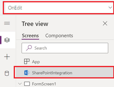
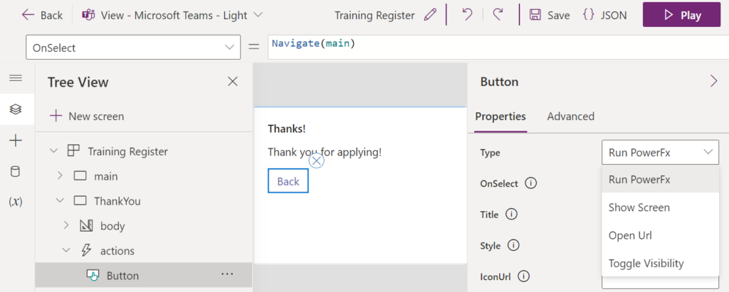
Every SharePoint list custom form built with Power Apps has integration events that are triggered when interact with the item and the form is open or closed.
You can find those events and add Power Fx formulas to them in the SharePoint integration object:
There are 5 available events:
OnNew: triggers when the form is open to create a new item
OnEdit: triggers when the form is open to edit an existing item
OnView: triggers when the form is open to view an existing item
OnSave: triggers when the save button is clicked
OnCancel: triggers when the cancel button is clicked
You can use global variables in your app, and reset them in those events if needed, so if you load another item from the list, it won’t be getting wrong variable values.
Bear in mind those events are triggered from the Power Apps form only, so if you are using quick edit view, they will not be triggered.
Conclusion
By using the SharePoint integration events we can proper handle variables in a custom form.
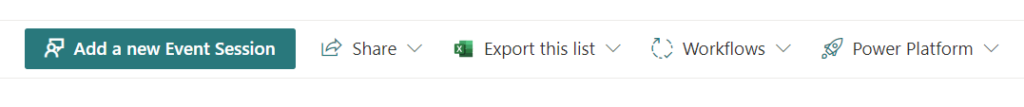
The same customization features can be used to edit the buttons icons and titles, for example, below we have a custom bar that replaced some of the native buttons icons and text.
By adding values to the ‘text‘ and ‘iconName‘ properties we can accomplish this.
For example, if we apply the below JSON snippet as view formatter in a view:
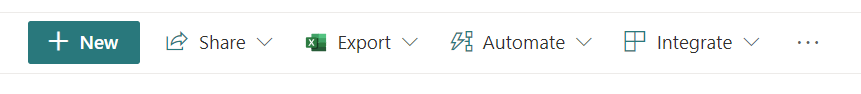
It will replace the native icons/text for the buttons/menus:
New: Change the icon and change the text to ‘Add a new Event Session’
Export: Change the text to export this list
Automate: Change the icon, and change the text to ‘Workflows’
Integrate: Change the icon, and change the text to ‘Power Platform’
So the command bar will change from:
To:
Finding icons to use
The icons you can use to customize the command bar are the same as Microsoft’s Fluent UI, you can search them and grab the name on this page: Fluent UI Icons
Conclusion
By using JSON formatting we can easily change icons and text for list command bar buttons. Bear in mind the changes affect only the view where you apply them, they need to be manually applied in every view you want them to take effect.
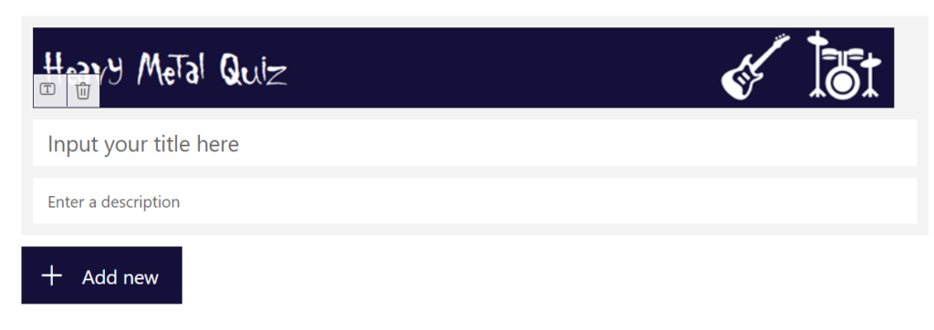
If we want to create custom headers for Microsoft Forms, as we don’t have many customisation options, an alternative way would be to create a custom image.
But if we want to add the form title to the image and leave it as blank as below:
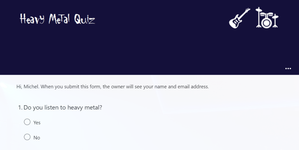
Forms always will set the title as ‘Untitled Form’ when you save it, even if you add spaces to it:
However, it turns out that if we add the ‘zero-width space character‘ to the form title, it is preserved:
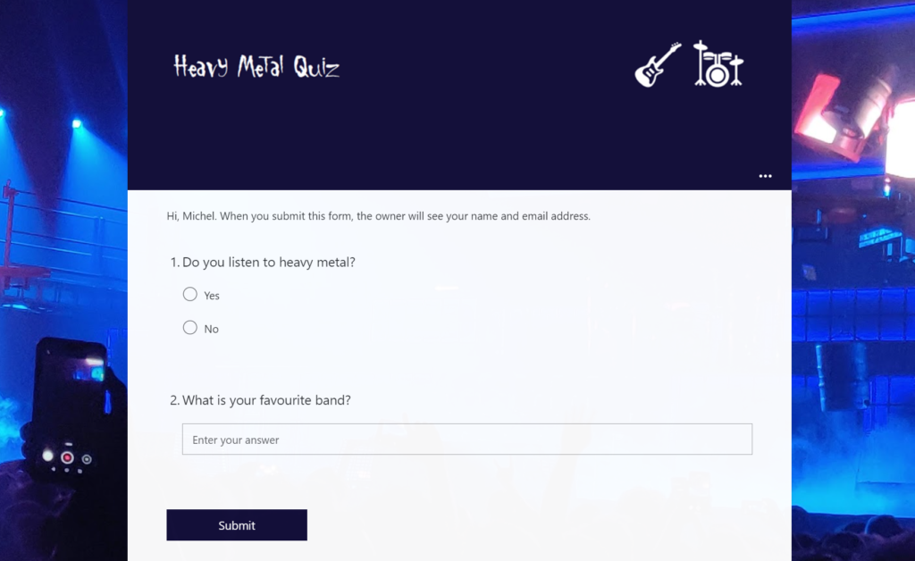
To add this character, you can simply copy it using the button below, and paste it into your Form title:
And that’s it!
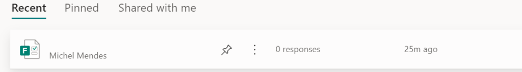
Important to remember that as the form had the title removed, it will appear without a title in your forms list:
Note:The image size that worked best for me was 1100×100 for the custom image. When editing the form it won’t show in full size but when playing the form from the shared link it will display properly.
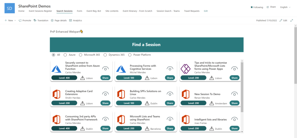
By detecting the theme parameter that Teams passes to Power Apps canvas apps when added as Tabs or Personal apps, we are able to make them Teams theme aware, but the same does not happen when we add a Canvas app to SharePoint using the standard Power Apps WebPart.
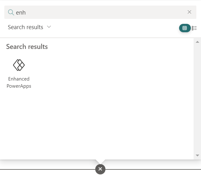
However, there is a free open-source sample in the Microsoft 365 PnP sp-dev-fx-webparts Repository (Enhanced Power Apps WebPart) that we can use to help achieving that. This WebPart adds extra features, such as dynamic resizing, theme awareness, and dynamic data detection.
Configuring theme variables in the Canvas App / Preparing it to be theme aware
If you have the App.OnStart function enabled in your app, use the following code on it, otherwise use it in the Screen.OnVisible event of the screen of your Start screen:
With(
    {tmpTheme: Param("theme")},
    If(
        !IsBlank(tmpTheme),//If this parameter is not blank, App is running on Teams
        Set(
            appTheme,
            {
                bodyBackground: If(
                    tmpTheme = "dark",
                    RGBA(31,31,31,1),
                    tmpTheme = "contrast",
                    Black,
                    RGBA(245,245,245,1)
                ),
                bodyText: If(
                    tmpTheme = "dark",
                    White,
                    tmpTheme = "contrast",
                    Yellow,
                    Black
                ),
                buttonBackground: If(
                    tmpTheme = "dark",
                    RGBA(98,100,167,0.2),
                    RGBA(98,100,167,1)
                ),
                buttonText: If(
                    tmpTheme = "dark",
                    White,
                    tmpTheme = "contrast",
                    Yellow,
                    White
                )
            }
        ),
        //Otherwise it is in SharePoint, or Standalone.
        //Check values passed by the WebPart, otherwise uses a default one
        Set(
            appTheme,
            {
                bodyBackground: ColorValue(
                    Coalesce(
                        Param("bodyBackground"),
                        "white"
                    )
                ),
                bodyText: ColorValue(
                    Coalesce(
                        Param("bodyText"),
                        "black"
                    )
                ),
                buttonBackground: ColorValue(
                    Coalesce(
                        Param("primaryButtonBackground"),
                        "gray"
                    )
                ),
                buttonText: ColorValue(
                    Coalesce(
                        Param("primaryButtonText"),
                        "white"
                    )
                )
            }
        );
    )
);
The above code checks for the Teams theme parameter presence, and if it’s present it sets the colours according to Teams standards. The colours are not sent by Teams to the app, but by detecting the theme name we can manually set the variable value to the same colour schema.
If the Teams theme is not present, it means the app is running either as standalone, or as part of a page with the Enhanced Power Apps WebPart added. Then in this piece, the values configured earlier are checked, in case they are blank, default values are used by using the coalesce function.
Using the theme to make the app colours become dynamic
In this post’s sample app, the theme variable colours will have the following usage:
bodyBackground: colour for app body background, galleries background
bodyText: colour for common text in the app/galleries
buttonText: to be used in button text font colour
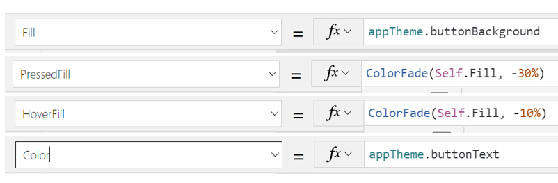
buttonBackground: to be used in buttons background, header background, icon colours. The same colour can be used in PressedFill / HoverFill with the help of the ColorFade function to give us the hover/click feel.
Sample properties for a button:
To make dynamic colours as in the session level field we use in the app’s galleries (button in view mode instead of a standard label in order to be able to use border radius):
We can use the colorfade function based on the session level value (choice) as below:
You will need to upload the WebPart either to the global app catalog, or to a site collection app catalog, in case you want to restrict it to a single SharePoint site collection. After uploading the WebPart and installing it to the site you want, now you need to add the WebPart to a SharePoint page.
Add the WebPart to a SharePoint page
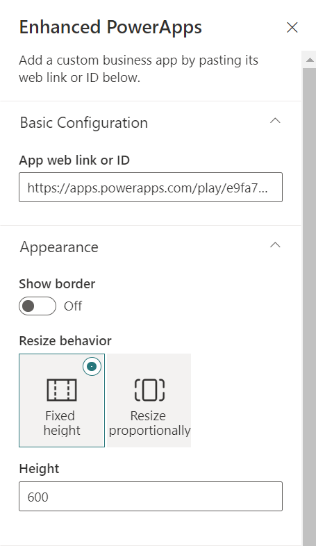
After the WebPart is deployed & installed to the site, create a page and find the WebPart to add it from the gallery (preferrably to a one-column section):
Add the WebPart link, and select the settings you wish for layout. My preference is to keep it without borders and set fixed height (responsiveness works better this way):
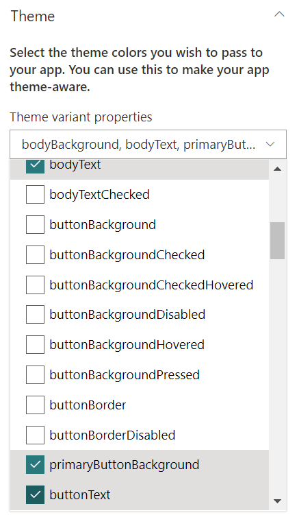
Select also the theme properties to send as parameter:
In this example we will need the following properties:
bodyBackground
bodyText
primaryButtonBackground
buttonText
There are more useful properties, but as in the Canvas App we are using colour fading options, in this case those 4 are enough to illustrate the idea. Save the page and you are now good to go.
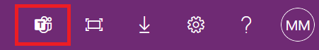
If you want to add the Canvas App to teams as a Teams app, you can easily do that from the Canvas App web player, from the top right side menu:
Then select where to add it in Teams:
Or alternatively, export a deployment package from the maker portal and deploy it globally from the Teams Admin center.
Results
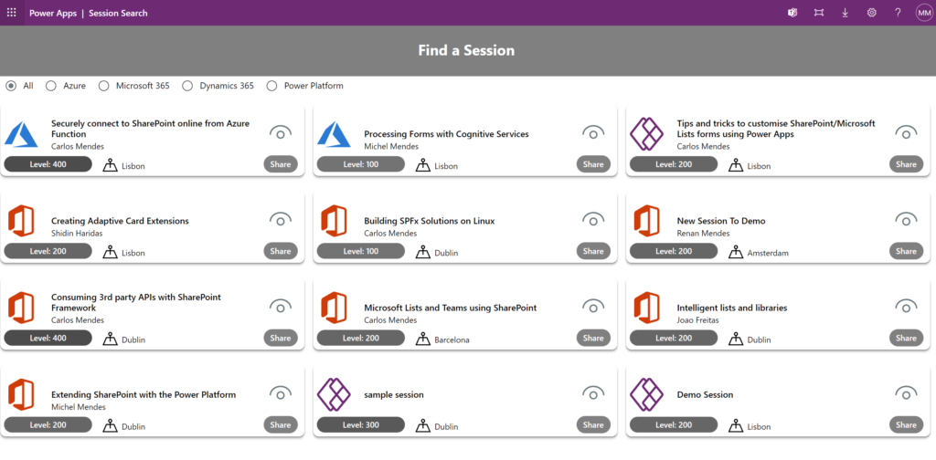
Now, according to where you use the Canvas app, the theme will be dynamically detected and it will adjust itself as below.
Standalone Canvas App outside of SharePoint:
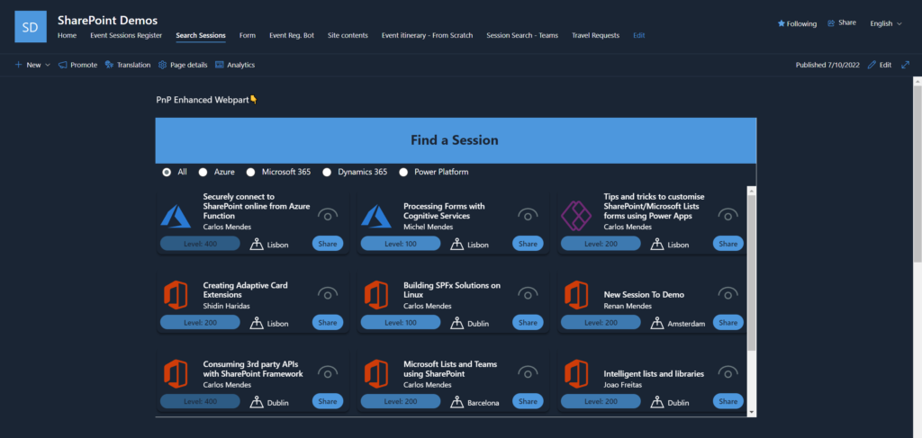
Canvas App added to a SharePoint page in a Site with bright themes:
Canvas App added to a SharePoint page in a Site with a dark theme:
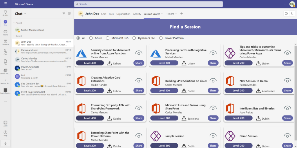
App installed in Teams running Default theme:
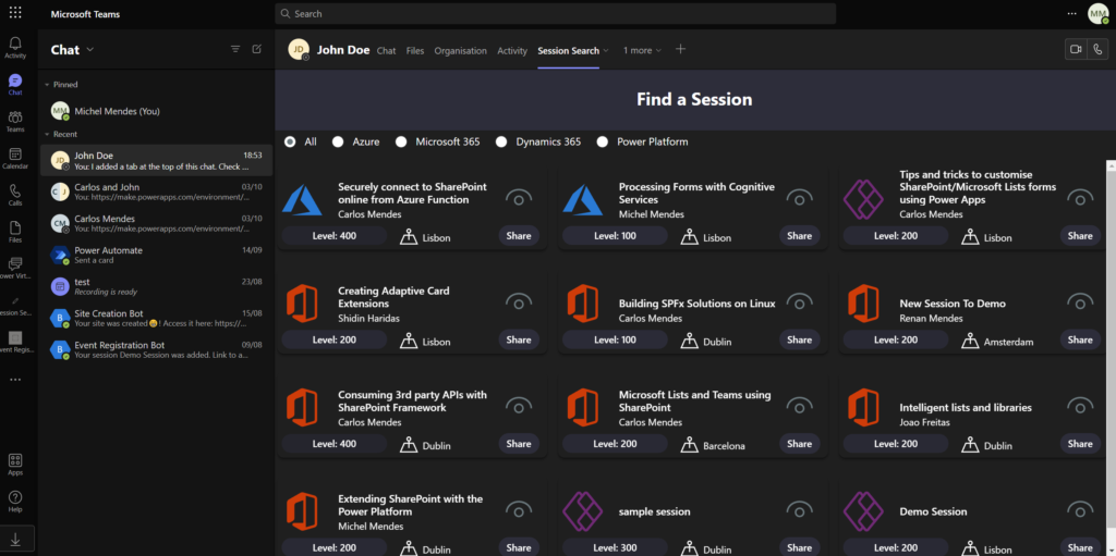
App installed in Teams running Dark theme:
Conclusion
By detecting querystring parameters sent to a Canvas App and with the help of the PnP Enhanced Power Apps WebPart, we are able to make the same Canvas app be aware of the themes of SharePoint and Teams.
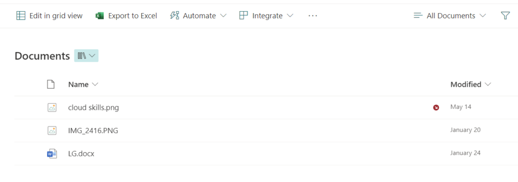
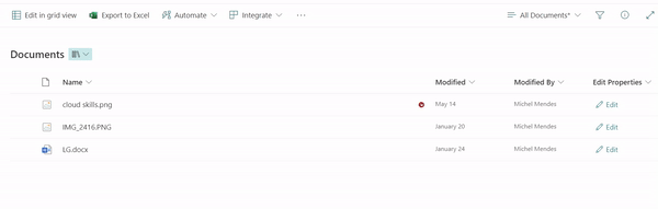
Recently I got a query about hiding the New and Upload buttons for a SharePoint library, because there was a need to allow users to browse documents using out-of-the-box SharePoint views in a library while still having permissions to upload files so that they could upload files using an SPFx WebPart or a Canvas App.
This request can easily be achieved using list formatting, by adding customisations to the command bar to hide some buttons as below:
Items to hide/JSON content
Using list formatting, there is an option to hide an out-of-the-box SharePoint button from the command bar in a view (for both lists and libraries).
To hide the New and Upload buttons from a view, you can simply use the below JSON, by mentioning the command key, and the property ‘hide‘ as true:
Although I also recommend if that is the purpose, you also hide the ‘Sync’, ‘Add shortcut to OneDrive’ and ‘Pin to quick access’ options, to avoid the users bypassing your custom upload form. You can use the below JSON formatting to do so:
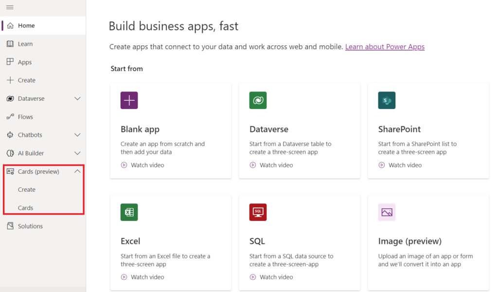
Cards For Power Apps (Preview) is a new type of app in the Power Apps family, designed to be used as mini apps instead of full-fledged web pages or mobile apps as normally Canvas apps are used to build. Cards are based on the same technology that powers Adaptive Cards.
As Cards for Power Apps support Power Fx, logic and data manipulation can be easily done with PowerFx and also with the help of Power Platform connectors, instead of tweaking JSON content or building external applications or Power Automate flows to parse the data.
By now only Microsoft Dataverse is available, but more connectors will be supported in the future.
Creating cards
To create cards, from the maker portal, check the new option called ‘Cards (Preview)’, where you can see all your cards or create a new card (if it’s already available in your tenant):
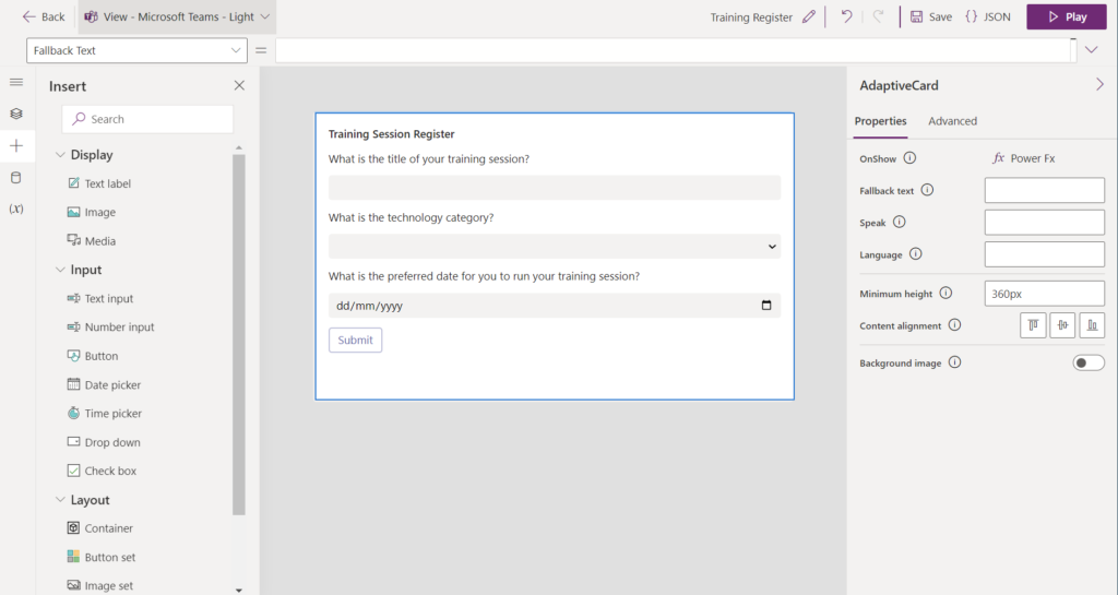
The Power Apps cards drag & drop no-code card designer allows quick card design and behaviours setup (but still allows editing the cards using JSON).
The card designer also uses the screen concept like a Canvas app uses, enabling multiple cards to be part of the same card app. Navigation between cards can be controlled using custom Power Fx code:
Variables usage
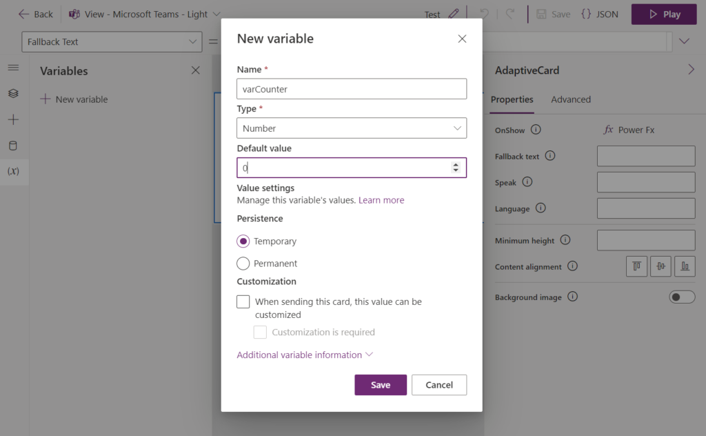
A new variable persistence concept is introduced in Cards for Power Apps, and also in order to use variables, the variables need to be explicitly configured in the app:
Two persistence types for variables are available to use in Cards:
Temporary: The value is reset in each card session
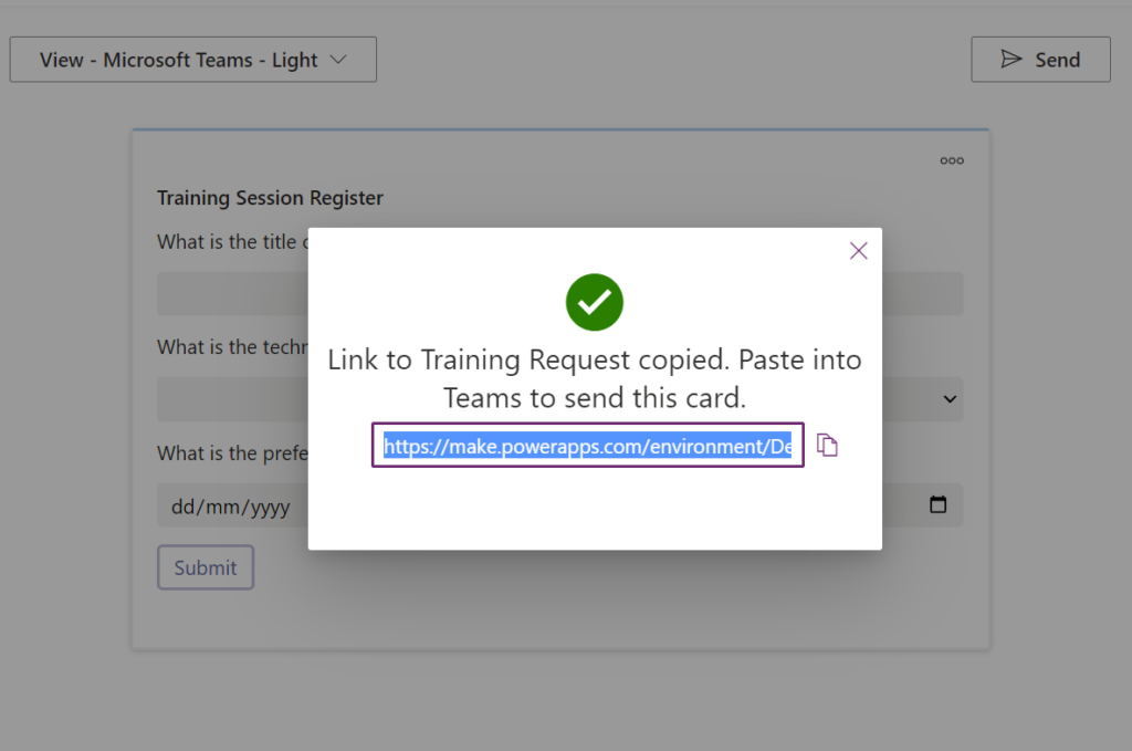
Permanent: The value is persistent across card sessions in the same card instance, even if the card is sent to different users. Worth noting if you run the card to grab its shareable URL, it will generate a new instance, that then would clear the variable values. You can note that by each time a shareable link is generated, a different instance identifier is used in the end, e.g: https://make.powerapps.com/environment/<env-id>/cards/play/<card-id>/<card-instance-id>
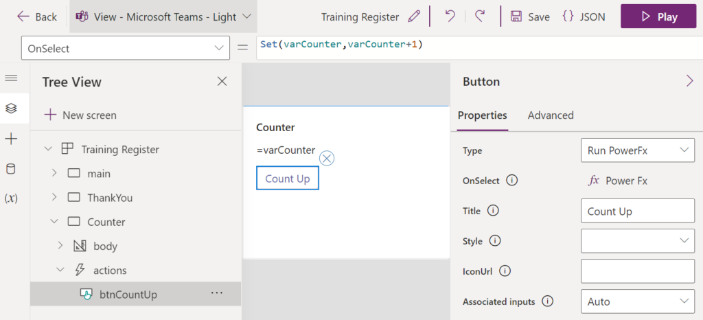
The same Set function is used to update variables in a Card:
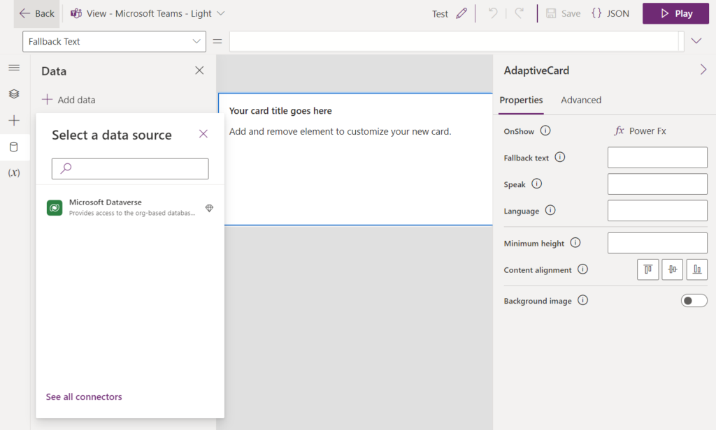
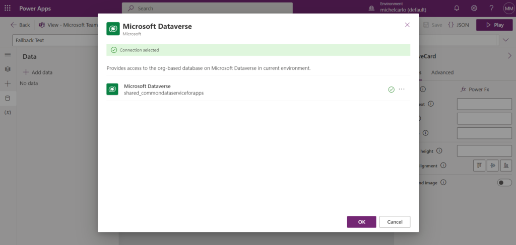
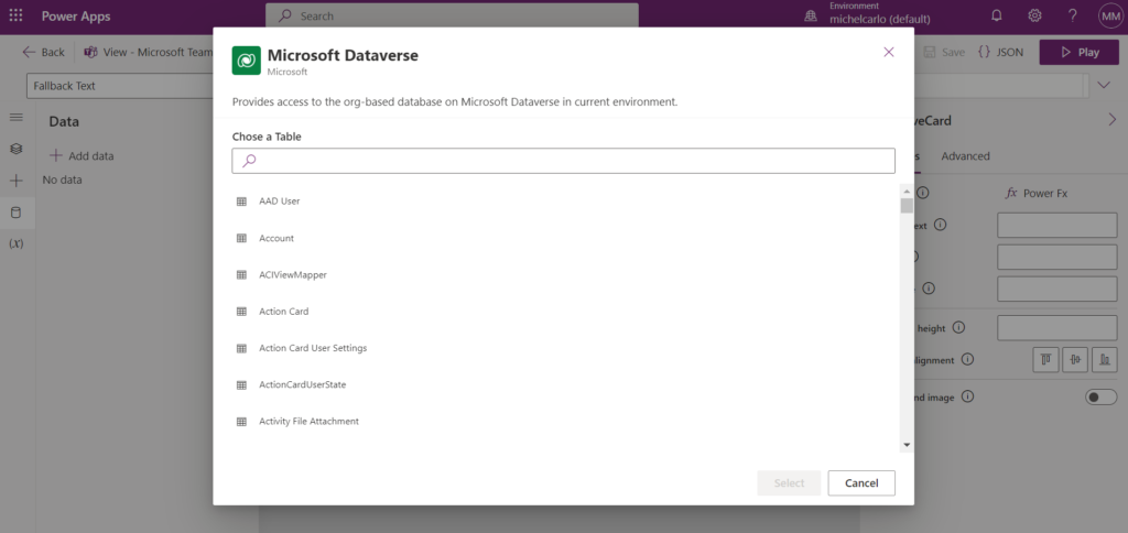
Connectors usage
To add a new connector, the process is similar to a Canvas app, from the Data pane, you can select Dataverse, select a connection, and pick a table to be used:
Then you will be able to use standard Power Fx formulas such as Filter, Lookup, Patch and Collect to manipulate Dataverse data.
Updating data / Adding data to Dataverse tables
Slight differences in the approach for updating data from Cards:
To update an existing item, you can run the following Power Fx code from a button:
Patch(prefix_yourtablename,LookUp(prefix_yourtablename,Name = txtNameFilter),{ Comment : "Updated from Cards!"})
If you want to reference a choice set, text box or other control’s value/selection, simply use the control name instead:
Patch(prefix_yourtablename, LookUp(prefix_yourtablename, Name = txtNameFilter), { Comment: myTextInput })
But for new items, patching with defaults needs to be replaced with a Collect function call (so far by now it is the only supported way), for example normally in a Canvas app we would do something like:
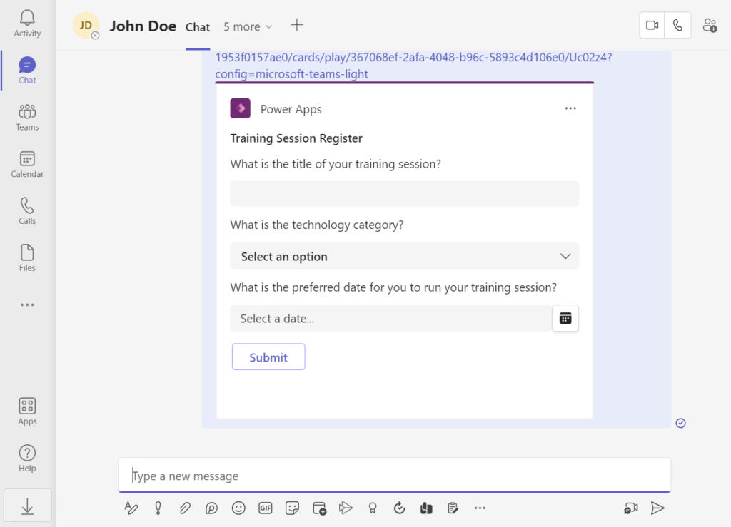
From the Cards for Power Apps player, by clicking the ‘Send’ button you can get a shareable link.
After this link is pasted in a teams chat, the link will automatically render the card directly within the conversation and users can interact with it:
Conclusion
With Cards for Power Apps, quick and powerful Adaptive-card experiences can be built to be used within Teams.
Instead of the standard process of purely using JSON to design Adaptive Cards and handling logic with a full custom Teams app/bot (which also requires additional setup as configuring an Azure AD app for your bot application) or logic in separate workflows built with Power Automate/Logic Apps, with Cards you quickly build interactive cards with a drag-and-drop designer, connect to data using Power Platform connectors and easily add logic using Power Fx language.
Microsoft Ignite 2022 brought several amazing announcements across all the Microsoft cloud platform.
If you interested in updates related to Microsoft 365 collaboration tools (SharePoint/Teams/Viva & related) and the Power Platform and want to know more details, or in case you missed any updates, here is a curated list of posts from Microsoft official blogs & sites released during Ignite with most of the relevant news:
The same technique can be applied to call Microsoft Graph API, as in the example below where we retrieve the list of group members from a Microsoft 365 group, including nested group members (an action that cannot be done using the standard Microsoft 365 Groups action):
Why call Graph if we have Office 365 products connectors and actions in Power Apps?
Even though there are several actions available for Office 365 products in Power Apps, they don’t fully cover what we can accomplish using Microsoft Graph. For example, some actions we could do with Graph that are not available out-of-the-box (explained below in this blog post):
Create a Microsoft 365 Group
List nested groups members from an Office 365 group
Dynamically detect the root SharePoint site of the tenant (useful if you want to grab this value and make an app or flow ‘tenant agnostic’ while running HTTP requests to SharePoint)
There is an existing and direct ‘Send an HTTP Request’ option from the Office 365 Groups connector in Power Apps canvas apps, but this option runs the queries but doesn’t return objects as results (it only returns a boolean). Hence, this technique of calling a Power Automate flow and returning the results is useful.
Before creating the flow and calling it from the Canvas App, enable the experimental feature as explained in my previous post.
Creating the Flow
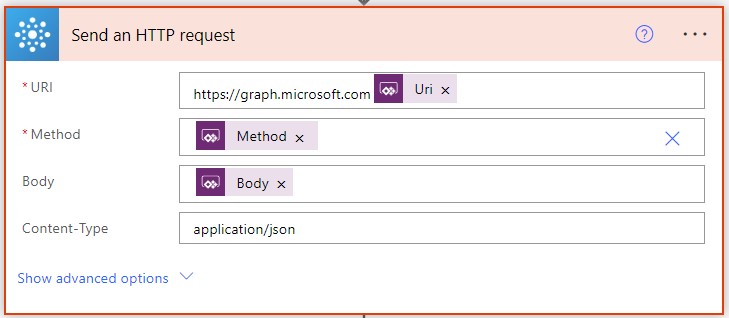
To keep using only standard licenses, let’s use the action ‘Send an HTTP Request’ from the Office 365 connectors.
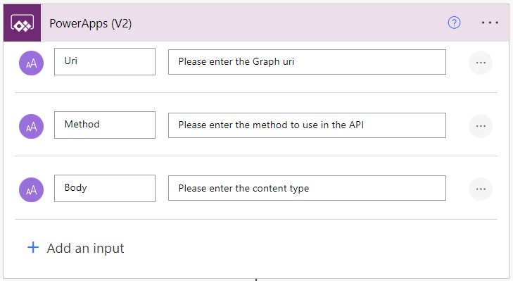
To simplify the use case, in this Flow let’s only require the Graph endpoint, method and request body in the Trigger (Power Apps V2):
Add a ‘Send an HTTP Request’ action from the Office 365 Groups connector after the trigger, as below. In this example, we already prepend the path ‘https://graph.microsoft.com’ to the field, so we can only specify the endpoint piece of Graph when calling it from Power Apps:
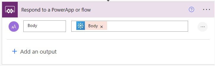
The final action is simply to pass the response back to Power Apps:
Sending requests and parsing the results from Power Apps
Save the flow with the name ‘GraphHTTP’ and add it to your canvas app from the Power Automate pane:
Now that the Flow is added, you can then call Graph from the flow and parse the results back as in the examples below.
Listing Group Members
The sample query below runs a GET request against the groups segment in Microsoft Graph and lists all group members (including nested members) using the Flow, stores it in a String variable named locResponseBody, parses it using the ParseJSON function and then converts it to a proper table of typed objects by using a combination of AddColumns + DropColumns formulas (adding custom columns with transformed values, then removing the original ‘Value‘ property), which is stored in a collection named colGroupMembers (replace yourGroupIdGuid by your Group Id).
In the example below, the Flow is used to call Graph and create a Microsoft 365 group from a Canvas App (and store the response as an object in the local variable locGroupObject) by calling a POST request against the groups segment in Graph and passing the details of the group to be created in the request body:
Getting the address of the SharePoint root site of the tenant
In the example below, the Flow is used to call Graph and retrieve the root SharePoint site address of the tenant by running a simple GET request against the sites/root segment in Graph:
The standard action ‘Send an HTTP Request’ in the Office 365 Groups connectors does not give us objects as responses, but we can use a Power Automate flow to do the job in this case.
This enables extra scenarios for querying and actions in Graph beyond the standard ones, within the endpoints that are accepted by the ‘Send an HTTP Request’ action under Office 365 Groups.
Remember that the ParseJSON feature is experimental, so for now it should not be used in Production apps.
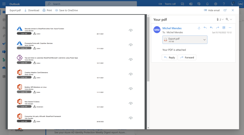
With the recently experimental PDF feature that is available from Power Apps authoring versions 3.22094.* we are now able to export screens, galleries and containers to PDF and obtain the output of this export as bytes, and use it on the PDF viewer or send it to a flow, so we can save it to SharePoint, OneDrive and etc.
The advantage of this approach instead using the Print function to print screens is that we can get the full content of galleries/containers in a PDF, so we are not limited to only what is displayed in the screen.
The text in the PDF file exported using this function is also selectable, so we are here exporting ‘real’ PDFs, and not screenshots from screens into PDF files:
Sending the exported PDF in an email message
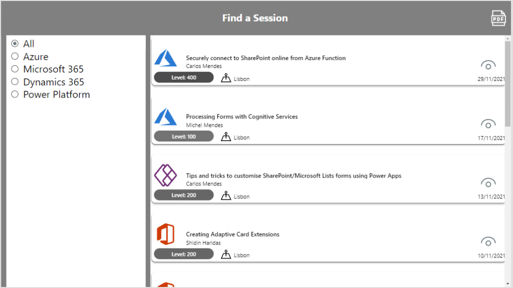
Consider you have a gallery with content you want to export as below. The gallery content is not fully visible as below:
The PDF export function is really simple, you can use it to generate content directly or to save it in variables to be used later.
But in this example let’s only call it directly from the Office 365 Outlook Connector (Send an email V2) action.
Add the Office 365 Outlook connector to your app, and then simply add the code as the example below to a button/icon to Export the gallery to PDF and send the content as an Attachment:
Office365Outlook.SendEmailV2(
    "user@tenant.onmicrosoft.com",
    "Your pdf",
    "Your PDF is attached",
    {
        From: User().Email,
        Attachments: Table(
            {
                ContentBytes: PDF(
                    galSessionsData,
                    {
                        Orientation: PaperOrientation.Portrait,//Portrait or Landscape
                        Size: PaperSize.A4,//Select your page size
                        DPI: 150,
                        ExpandContainers: true /* This property makes sure the full content of gallery/containers is expanded as PDF */
                    }
                ),
                Name: "Export.pdf"
            }
        )
    }
);
Note that the Attachments parameter in the SendEmailV2 action expects a table of attachment objects with the ContentBytes and FileName as parameters. As ContentBytes we are using the PDF function to export it directly and send in the Email.
For the PDF function, use the proper DPI and page sizes you wish, but keep the ExpandContainers property value as true if you want to export the full gallery.
Results
After the button is clicked, the recipient will receive an email with a PDF copy of the gallery attached, as below:
Note: As of now, the PDF export function will only export items that were already loaded in the app. So for example if you have a SharePoint list with 8000 items, by default the gallery component loads the items in batches as you scroll (not all the 8000 at first), and if you call the PDF function in a situation like this, it will export only the items that were already loaded into the gallery.
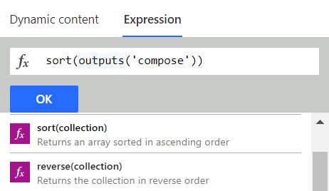
Until recently it was not possible to easily sort arrays or collections of objects in Power Automate using a single expression, either complex logic techniques or Office Scripts were required.
But recently two new handy expressions became available in Power Automate that make it really simple to do:
sort
reverse
How the sort expression work
The sort expression accepts either an array with simple values or a collection of objects.
If you pass a simple array to the expression, no parameter is needed. For example, if you have the following array variable with people’s names:
If you have an array/collection with objects, you need to specify a property to use in the sorting, so for example, consider an array variable named ‘NamesCountries’ as below:
The reverse function will only revert an array order, regardless of whether it is sorted or not. So for example, if we run it against the initial array of names mentioned above as below:
reverse(variables('Names'))
The output will be a reversed order array from the original one:
There is no second parameter accepted in this expression. If we use it against an array of objects, it will simply reverse the order of it. For example, using the below expression on top of the array of objects mentioned above:
reverse(variables('NamesCountries'))
Gives the output a reversed array based on its initial order:
By using the new sort and reverse expressions we can easily sort arrays and collections of objects, and avoid using complex techniques as it was needed earlier.
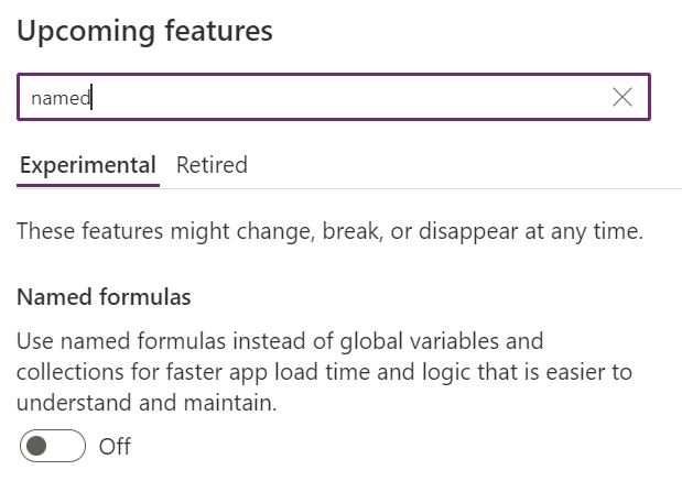
Recently Microsoft announced a new experimental feature in Power Apps: Named formulas
Named formulas in summary are, defined functions without parameters, that can be reused anywhere in a Canvas App.
What are the advantages of using Named formulas instead of global variables (defined with ‘Set’)?
The formula’s values are always available, there is no time dependency as it happens on App.OnStart (if you enabled delayed start, some variables might not have been populated when you try to access their values).
Formula definitions work like constants, they need to be defined in the App.Formulas property and cannot be updated anywhere else in the app
Also, the formula’s output values are only calculated when needed, which will speed up app loading times if you defined a lot of them in the App.OnStart event
How to use them?
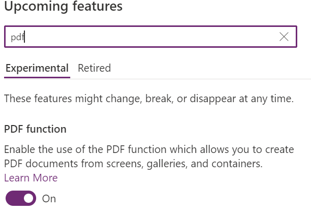
Enable Named formulas under experimental features (authoring version 3.22091):
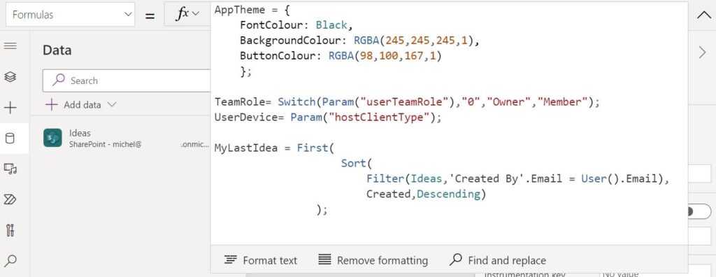
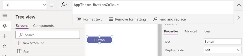
After enabling the feature and reloading the app, add your formulas to the App.Formulas property. You can even add objects as named formulas, for example, if you had an object variable that you used to store all colours for the app and work as the ‘app theme config’ variable, you can convert it to a named formula:
Call or reference them as if they were global variables from anywhere in the app (except for using ‘Set’, so for example Set(myFormula,”Value”) would not work.
In the example below we are using a reference to a named formula to define the button fill color:
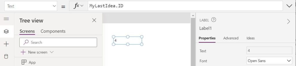
And below using a reference to a record to retrieve the last item submitted by the current user. This would also return the latest item Id as the formula values are always up to date, and we don’t need to worry about refreshing their values as we do with global variables:
Conclusion
By using the named formulas feature you can speed up your app’s loading time in case you had a lot of global variables defined on the App.OnStart event, while enabling functions that are read-only and will always have their return values up to date.
Some time ago I blogged about using Power Automate to create Planner Plans and recently I got a query on that post about adding the created plan to the General channel of the related Team as a tab.
The procedure to add a Planner plan as a tab using Graph is not documented by Microsoft, but by investigating manually added examples (using Graph Explorer to retrieve the tab content format), we can figure out how the structure of a Planner tab works. Bear in mind this is not a documented procedure and may break if the tab setup structure change later.
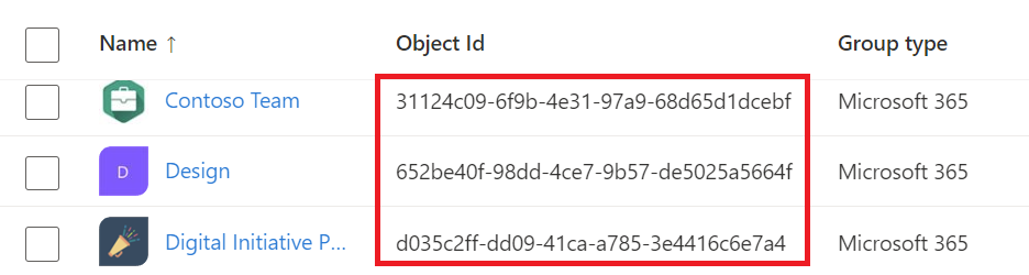
Find your Team ID (Microsoft 365 Group ID)
Find the ID of the Group/Team (easily found under Groups in the Azure portal) you want to create the planner plan and add it as a Tab:
It will be needed in the Flow so we can create the Plan under it and also set up the tab in the related Team.
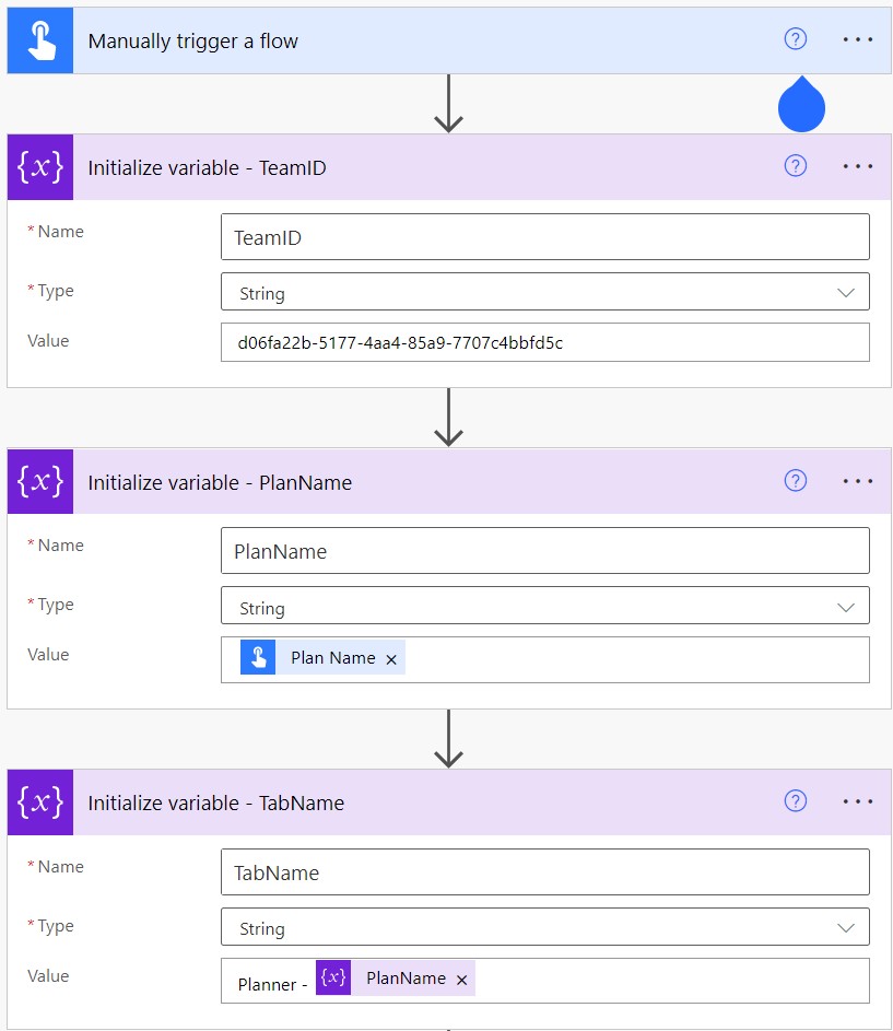
Creating the Flow
For demo purposes, let’s create a manually Triggered flow. This can be tweaked so your Flow is part of a bigger automation piece, so let’s add the Plan name input also as a variable, making the reference able to be changed easily if needed. We also need another variable to store the Tab Name (in this case we simply prepend ‘Planner – ‘ to the Plan name) and the Team ID (which you got from Azure AD):
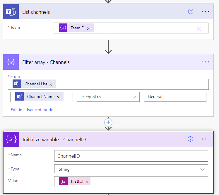
Retrieving the Channel ID
Next, we need to retrieve the ID of the General channel. To do it we list all channels from the Team we chose, run a filter action on top of the list and save the first result in a variable:
The formula for the first entry ID (considering a renamed Filter array action as above):
first(body('Filter_array_-_Channels'))['Id']
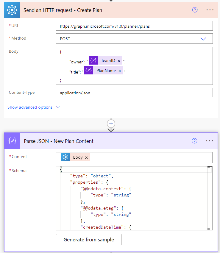
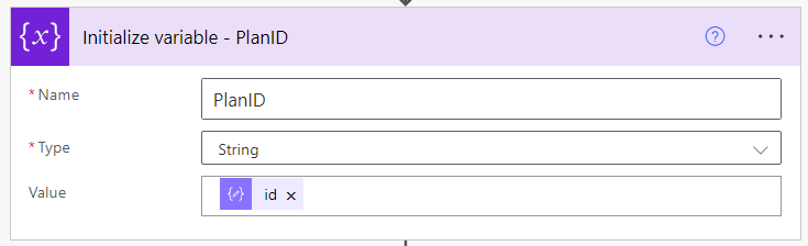
Creating the Planand parsing the created plan data
To create the plan we can use the ‘Send an HTTP Request’ action from the Office 356 connectors and run a call to Microsoft Graph, then parse the response using the ‘Parse JSON’ action as below:
The below schema can be used to parse the Request Body:
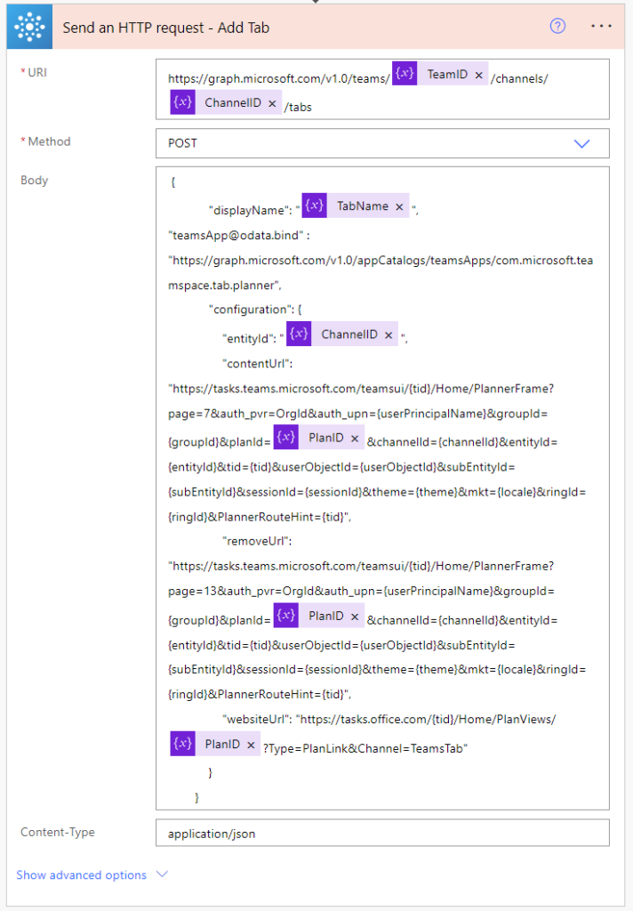
The last step is to call a POST request in the Graph endpoint related to the Channel tabs with the Planner configuration as body, as below:
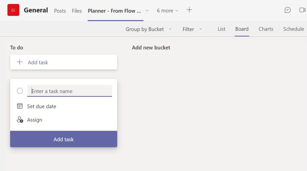
This will add Planner as a tab to the General channel of the Team, and specify the Plan to use in that tab.
Given that all the variables in the flow respect the names of the sample pictures above, the below code can be copied and pasted into your ‘Send an HTTP request’ action’s body. This is what instructs teams what are the configuration details for the Planner tab:
 Connexion
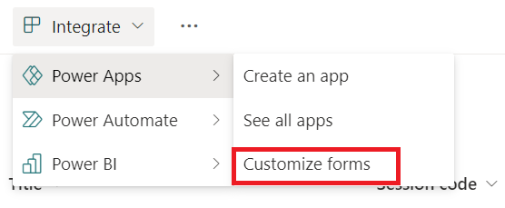


 Follow me on
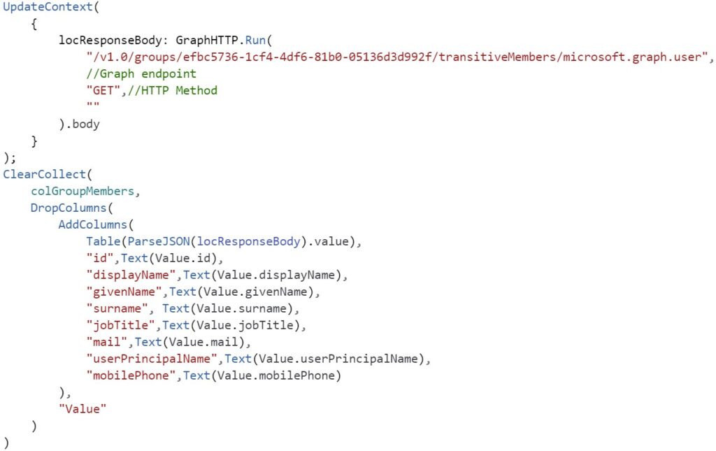