 Connexion
Add Multiple control in SPFX Web Part Property Pane
Developing custom components require technical skills but to make it reusable, one need to add configurations to it and this might require a few lines of extra code but will make the component leverage to do customizations on the fly instead of redeploying the component again and again and can be used as a reusable component
Today I will share the scripts to add different type of controls in an SPFx web part which could help to perform different actions and configurations in your web part. I will be using SPFX and PnP property pane controls. For PnP controls, you need to install PnP control module to your solution.
Today I will be sharing Below components to the Property Control
- Text Field – PropertyPaneTextField
- SharePoint List Picker Control – PropertyFieldListPicker
- Date Field – PropertyFieldDateTimePicker
- Number Field – PropertyFieldNumber
- Dropdown – PropertyPaneDropdown
- Checkbox – PropertyPaneCheckbox
- Color picker – PropertyFieldSwatchColorPicker
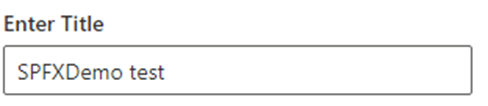
Text Field – PropertyPaneTextField Control
This is the most simple control which you can see when you create a new spfx web part, a default Text field control is added to the property Pane.
Import Section
import {
  IPropertyPaneConfiguration,
  PropertyPaneTextField
} from '@microsoft/sp-property-pane';
Declare property in Export interface
export interface ISpfxDemoWebPartProps {
  title: string;
}
Code Snippet
 PropertyPaneTextField('title', {
                  label: "Enter Title"

})
SharePoint List Picker Control – PropertyFieldListPicker Control
This control shows all the SharePoint list and libraries under current SharePoint site

Import Section
import { PropertyFieldListPicker, PropertyFieldListPickerOrderBy } from '@pnp/spfx-property-controls/lib/PropertyFieldListPicker';Declare property in Export interface
export interface ISpfxDemoWebPartProps {
  listId?: string;
}
Code Snippet
PropertyFieldListPicker('listId', {
                  label: 'Select List',
                  selectedList: this.properties.listId,
                  orderBy: PropertyFieldListPickerOrderBy.Title,
                  includeHidden: false,
                  onPropertyChange: this.onPropertyPaneFieldChanged.bind(this),
                  properties: this.properties,
                  context: this.context,
                  deferredValidationTime: 0,
                  key: 'listId'
                })
Date Field – PropertyFieldDateTimePicker Control
This control will help you to select the Date and time.

Import Section
import { PropertyFieldDateTimePicker, DateConvention, TimeConvention, IDateTimeFieldValue } from '@pnp/spfx-property-controls/lib/PropertyFieldDateTimePicker';Declare property in Export interface
export interface ISpfxDemoWebPartProps {
   defaultDate?: IDateTimeFieldValue;
 }
Code Snippet
PropertyFieldDateTimePicker('defaultDate', {
                  label: 'Default Date',
                  initialDate: this.properties.defaultDate,
                  dateConvention: DateConvention.Date,
                  onPropertyChange: this.onPropertyPaneFieldChanged,
                  properties: this.properties,
                  deferredValidationTime: 0,
                  key: 'defaultDate'
                })
Number Field – PropertyFieldNumber Control
This control allows you to select a numeric value from property pane. You can also set min and max value for the control.

Import Section
import { PropertyFieldNumber } from '@pnp/spfx-property-controls/lib/PropertyFieldNumber';Declare property in Export interface
export interface ISpfxDemoWebPartProps {
  repeatValue?: number;
}
Code Snippet
PropertyFieldNumber("repeatValue", {
                  key: "repeatValue",
                  label: "Select Repeat Value",
                  description: "Number field ",
                  value: this.properties.repeatValue,
                  maxValue: 10,
                  minValue: 1,
                  disabled: false
                })
Dropdown – PropertyPaneDropdown Control
The control is used to select a value from a choice of list, you can add custom values to it as I am using it for language selection.

Import Section
import { PropertyPaneDropdown } from '@microsoft/sp-property-pane';Declare property in Export interface
export interface ISpfxDemoWebPartProps {
  language?: string;
}
Code Snippet
PropertyPaneDropdown('language', {
                  label: "Select Language",
                  options: [
                    { key: 'Eng', text:'English'},
                    { key: 'Ur', text:'Urdu'},
                    { key: 'Ar', text:'Arabic'}
                  ]
                })
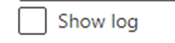
Checkbox – PropertyPaneCheckbox Control
This control is available with sp-property-pane module. It is used to show a checkbox on the control which could be use for multiple reasons. I used it for enabling logs in my solution.
Import Section
import { PropertyPaneCheckbox } from '@microsoft/sp-property-pane';Declare property in Export interface
export interface ISpfxDemoWebPartProps {
  showlogs?: string;
}
Code Snippet
PropertyPaneCheckbox('showlogs',{
                  checked:false,
                  disabled:false,
                  text: 'Show log'
                })
Color picker – PropertyFieldSwatchColorPicker Control
This control allows you to pick a color and you can define a list of color to be available for selection.

Import Section
import { PropertyFieldSwatchColorPicker, PropertyFieldSwatchColorPickerStyle } from '@pnp/spfx-property-controls/lib/PropertyFieldSwatchColorPicker';Declare property in Export interface
export interface ISpfxDemoWebPartProps {
  bgColor: string;
}
Code Snippet
PropertyFieldSwatchColorPicker('bgColor', {
                  label: 'Select Background Color',
                  selectedColor: this.properties.bgColor,
                  onPropertyChange: this.onPropertyPaneFieldChanged,
                  properties: this.properties,
                  colors: [
                    { color: '#ffb900', label: 'Default Yellow' },
                    { color: '#fff100', label: 'Light Yellow' },
                    { color: '#d83b01', label: 'Orange'},
                    { color: '#e81123', label: 'Red' },
                    { color: '#a80000', label: 'Dark Red'},
                    { color: '#5c005c', label: 'Dark Magenta' },
                    { color: '#e3008c', label: 'Light Magenta'},
                    { color: '#5c2d91', label: 'Purple'},
                    { color: '#0078d4', label: 'Blue'},
                    { color: '#00bcf2', label: 'Light Blue' },
                    { color: '#008272', label: 'Teal'},
                    { color: '#107c10', label: 'Green'},
                    { color: '#bad80a', label: 'Light Green' },
                    { color: '#eaeaea'},
                    { color: 'black', label: 'Black'},
                    { color: '#333333', label: 'Neutral'},
                    { color: 'rgba(102, 102, 102, 0.5)', label: 'Half Gray' }
                  ],
                  key: 'bgColor'
                })
The post Add Multiple control in SPFX Web Part Property Pane appeared first on MS Technology Talk.